Earlier this month, I was able to head up to Portland, Oregon for the newest show to join the pen show circuit. The Portland pen show was small by way of the number of vendors, but large in number of attendees.
I met a new vendor at this show – the wonderful group from Oblation Papers – a nearby brick-and-mortar store. They have beautiful items that I rarely see at shows including handmade papers and vintage typewriters. I picked up several goodies from them including one that I’m showing today, the Kunisawa notebook called the Find Ring notebook.
The paper is only available in a 5mm graph ruling, and I chose the A5 notebook which has a heavy cardstock cover and ring-bound paper.
The 80 sheets in the notebook are made of a smooth, thick, and slightly creamy paper.
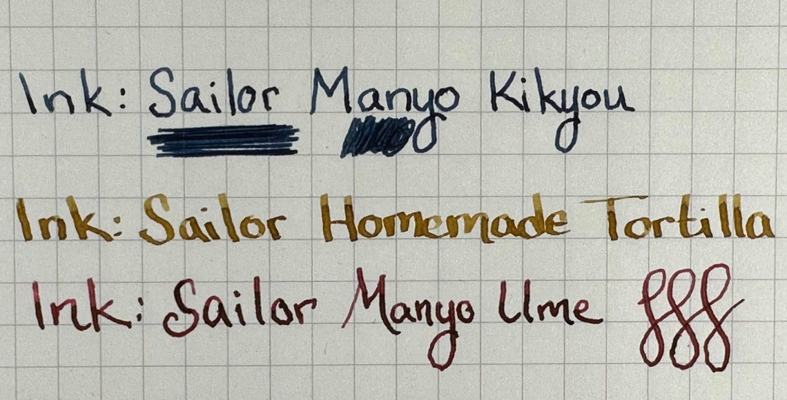
The shading in Sailor Homemade Tortilla is fabulous.
Even Van Dieman’s Wasabi shows distinct shading.
Sailor Manyo Kikyou gives a pleasant sheen – I was surprised at this – I hadn’t expected a sheen to show up on the paper.
Sailor Manyo Ume came through with a beautiful halo sheen in almost every letter.
Through all of the writing, scribbling, and heavy ink applications, there was never a sign of feathering, bleed-through or even ghosting.
My favorite small detail – the inside cover of the notebook includes a quote from Picasso:
At $15 for 80 pages, I do think this is a great purchase to add as an option for fountain pen lovers. beautiful sheen, shading, and it can handle any ink so far. Ring-bound notebooks are always welcome in this category as well!
DISCLAIMER: The items included in this review were purchased by me for the purpose of review. Please see the About page for more details.
This week, inspired by Kottke.org’s post about their “media diet”, I thought I’d post a short list of my stationery and media diet. What have you been watching, reading or listening to?
Your patronage supports this site. Please support our sponsors, affiliates or join our Patreon. Without you, we could not continue to do what we do. Thank you!
For a girl whose first love is knitting, and whose second love is pens, a combination of yarn and paper sounds odd, and also like it hits the spot right? So when I got an email from Hedgehog Fibers about their new recycled yarn notebooks (€9.50) I immediately bought two (one for Ana of course!)
Hedgehog Fibers already creates yarn that includes waste from other yarn production and recycled leftovers, so why not add some of that waste to paper? The notebooks are A6 (4.25″ x 6″, 11cm x 15cm) featuring a cover made of recycled paper and combined and pressed with yarn scraps. The inside of the notebooks feature 68 blank or lined recycled-paper pages. Each notebook is hand-bound with string, and is a one of a kind creation!
So I’ll start by saying that I bought this notebook because I was tickled by it, and not because I expected the paper to be great. The paper is interesting – I don’t have any specifics but it isn’t super thin. It looks like it has been pressed because there’s a gridded texture to it. And it feels a little cottony, almost like money (specifically US money) that has been worn.
As I suspected, the paper didn’t perform terribly well with fountain pen inks – even with fine and extra fine nibs there was lots of feathering. It performed a bit better with fine liners, and just fine with gel inks. Surprisingly, even with the feathering there wasn’t any bleed through except when I swatched ink on the paper with a brush. That was enough to create a few spots.
I confess I was a bit disappointed when I realized that the paper inside the notebook wasn’t pressed with yarn as well, but given the way the back cover looks, that would have made for a bumpy writing experience. Overall, I won’t be stocking up and hoarding these notebooks as my favorite paper ever, but I’m really glad I took the plunge on such a fun object that combines two of my favorite hobbies!
Thanks to Tina, the #21penquestions has been converted into 12 Pencil Questions. Why didn’t I think of this? I’m so glad that Tina did modify this meme. So here are my answers to her 12 Pencil Questions.
1. What is the pencil they’ll have to pry out of your cold, dead hands?
My Prismacolors . The new ones, the vintage ones and all the ones in between. Prismas make me happy. Sure, they break easily and shatter often. Sometimes. The core aren’t always centered but oh. The colors are so good. And when they work, they are the yardstick by which I measure the quality of all other colored pencils.
There are other pencils you would have to fight me for as well like my NoBlots, my Pantone Colored pencils and my collection of vintage red/blue pencils.
2. What’s your guilty pleasure pencil?
I have so many guilty pleasure pencils I can fill multiple cigar boxes with them. I love custom stamped pencils — especially if they have pithy messages on them. I love tourism pencils that are from specific places (often found in museum gift shops and such). I love advertising pencils, bullet pencils, vintage pencils and pencils from other countries. In general, I think my graphite pencil collection is 100% a guilty pleasure.
3. What’s the pencil you wish existed?
Good mechanical colored pencils. I want a creamy, saturated pigment core with a maximum diameter of 0.8mm that doesn’t break easily. I love having a colored mechanical pencil for travel and outdoor drawing adventures.
4. What pencil would you give to a new enthusiast?
For graphite pencils, any modern Japanese pencil from Tombow Mono or Uni-Mitsubishi Hi-Uni. They feel beautiful in the hand and write beautifully. Pencils do not have to be scratchy, gritty objects that people remember from grade school.
For colored pencils, I would recommend the Caran d’Ache Bi-Color in red and blue. Its creamy and luscious and its water soluble too. Its a great gateway into bi-color pencils AND colored pencils.
5. What pencil do you want to get along with but it just never clicked?
I know lots of people love the Uni Kuru Toga pencils. I appreciate the idea of a self-rotating mechanical pencil but I must be too fidgety because I don’t get the experience. I am not yucking someone else’s yum but this pencil is more technology than I need in a pencil.
6. What pencil do you keep only because it’s pretty?
I have some fancy designed pencils from Louise Fili. They are not the best tools but OOOH! the packaging and lettering is fantastic!
7. What pencil did you buy because everyone else did?
Not to parrot Tina but I also found the Irojiten colored pencils a bit overrated. I knew I wasn’t going to love them going into the purchase because I had heard they were harder cores, the pencils are all white except the end caps which are dipped to indicate the color which is a pet peeve of mine. Colored pencils benefit from being colored from top to bottom. It makes them easier to identify quickly.
8. What pencil is over your head or just baffles you?
Pretty much any pencil, particularly mechanical pencils, that have the gel grip section really makes me wonder. I wonder why pencils more often feature this grippy grip section than pens. And I also wonder why do we need this?
9. What pencil surprised you?
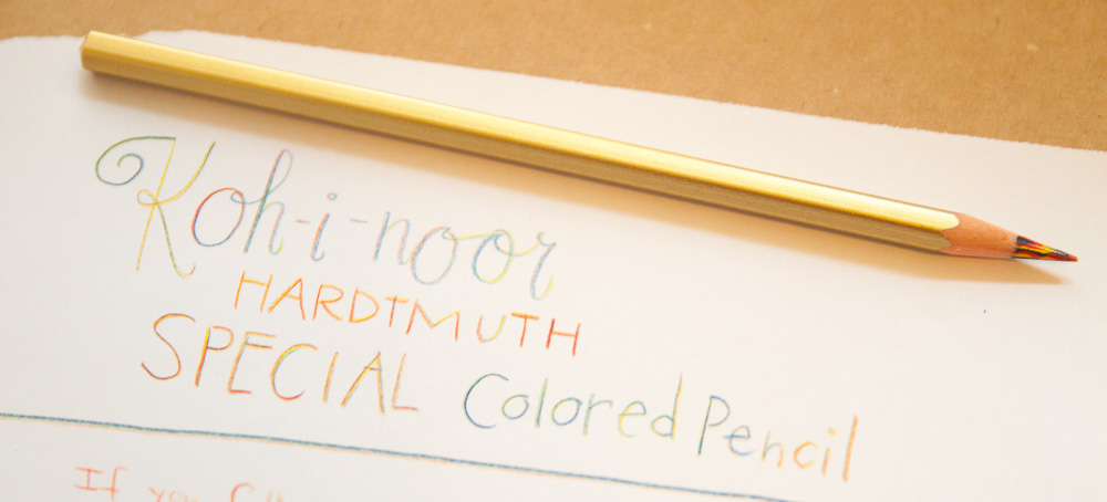
Magic pencils! I bought my first on a whim and fell in love with them. I prefer the classic red-yellow-blue Magic pencils over any of the other color combinations. The shades in the Koh-i-noor Magic pencils is the perfect shades of color and blend to create really uniquely. Thanks, Milton Glaser, for the inspiration too!
10. What pencil do you love in theory but not in practice?
Please don’t hate me, Tina! I want to love the Caran d’Ache Luminance colored pencils but I find the cores a bit too big. They feel like a jumbo pencil in my tiny little hands. They also don’t fit in my regular pencil sharpeners and they are SOOOOO expensive. I have a few and they are fantastic cores but I just don’t reach for them very often. The best way to try these is to visit a local art supply shop like Dick Blick and buy just a couple to try rather than buying a large box set.
11. What’s your favorite vintage pencil? And 12. What’s the pencil that got away?
The last two question, for me, are really the same question for me. Sanford NoBlots are my favorite vintage pencil and the ones that got away. I got my first (and last) full box of Sanford NoBlots on Amazon for about $15 about 15 years ago. It was 100% an accident. At the time I didn’t really know anything about NoBlots but they looked cool and $15 for 12 pencils was a steal no matter what they were. Well, by the time I figured out that I had the amazing indelible “ink” pencils, the dealer who was selling them on Amazon was sold out. Had I known what they were, I would have bought every box that was still available.
To be honest, this list is only slightly different than my Top 10 Pencils post from a couple years ago. Clearly, my tastes have not changed much.
Okay, now its your turn!
DISCLAIMER: Some items included in this review were provided free of charge by JetPens for the purpose of review. Other items in this post include affiliate links. The Well-Appointed Desk is a participant in the Amazon Services LLC Associates Program, an affiliate advertising program designed to provide a means for sites to earn advertising fees by advertising and linking to Amazon. Please see the About page for more details.
Tina upped the difficulty level with the #21penquestions by creating a new modification for pencil lovers, #12pencilquestions. I recognize that the gauntlet has been thrown and I will now need to answer her questions! The game is afoot!
We need each other. Please support our sponsors, affiliates or join our Patreon. Your patronage supports this site. Without them, and without you, we could not continue to do what we do. Thank you!
I love when Ana travels the country going to pen shows because she usually brings home some fun items for me to review. After the recent St. Louis Pen Show, she brought me more paper goodies to play with. The first is the Colorverse Nebula Casual Notebook ($15-16.50).
I always find it interesting when ink companies venture into paper products. Obviously they are highly complementary, but creating ink seems like such a different process than creating paper/notebook offerings. But I recently looked at some of the Wearingeul products as well so maybe I’m just behind the times?
The Casual Notebook is just what it says – a casual notebook. It’s A5 size, measuring 5.75″ x 8.25″ (14.5 cm x 21 cm). The covers (front and back) are cardstock and come in a variety of colors (baby pink, orange, dark navy, black, turquoise and oil green) with a few small foil details. Inside the notebook has 60 sheets (120 pages) of 90gsm white paper. The paper can be plain/blank, ruled or dotted and is perforated with easy tear sheets.
So how does the paper stack up? I’d say it’s pretty good. It’s an odd mix of fairly smooth, but also a little toothy. I know that sounds like an oxymoron doesn’t it? The ink goes down smoothly and dries fairly quickly. I did a smear test and only hit the last few words immediately. I tested a variety of pens (sadly I have very few M and B nibs – I need to work on that!), and even an ink swatch and only the Sharpie bled through. The paper is fairly wrinkled from the ink so I’d say this isn’t one for ink wash/watercolor, though nothing bled through!
Overall I thought this was a nice notebook, although I’m not sure it’s a standout to me. Have you tried Colorverse Nebula Casual Notebooks? I’d love to hear your thoughts!
DISCLAIMER: Some of the items included in this review were provided to us free of charge or at a discount for the purpose of review. Please see the About page for more details.
This weekend, we were hit with a fast-moving, very destructive storm that blew in on Friday afternoon and left us without power for the whole weekend. A tree had taken down our power lines which required an electrician to come out and repair the power connection at the house and then the power company had to come out and reattach the power lines to the pole outside and then re-connect them to our house and finally turn the power back on. This left us scrambling to find a friend to let us keep our refrigerator foods in their fridge, cleaning up yard debris from the storm and endlessly searching for power to keep our phones up and running while we coordinated with neighbors, electricians and framily (our family of friends).
So, what do you do when the power goes out? You organize your ink stash, of course!
Regardless of whether you have 10 inks or 200, looking through your collection and determining what you like, don’t like, where you have accumulated a lot of the same color or realize you don’t have a single orange ink, taking time to review your ink stash can be helpful. Especially if you have plans to attend a pen show in the near future or want to keep yourself from continually buying the same turquoise ink from different makers over and over.
These are the sheening inks that Diamine let their fans name. They hosted the naming contest saying that fans could choose any name, even Robert and Maureen, so of course EVERYONE voted for Robert & Maureen and hence, an ink legacy was born. I like that the mini bottles are labelled Bob and Mo.
Step One: Inventory
If you have access to power (and I hope you do!) you can start by using a spreadsheet or FPC (Fountain Pen Companion) to inventory your collection. This is a great way to get on top of your collection. Exactly how many bottles and samples currently exist in your collection. Are any bottles almost empty? Have any bottles never been touched?
Two of the permanent inks in my collection.
This is also a good opportunity to see if you have any specialty inks in your collection. I believe in my heart of hearts that everyone should have a bottle of black ink and/or a permanent or document ink (Platinum Carbon Black does both very well). I also think everyone should have one bottle of sheening ink — it doensn’t have to be a super sheener but the effect of sheen on paper is something that is a great addition to an ink collection and reminds us all why we fell in love with inks in the first place.
Pen BBS #111 was a very popular golden sheening ink. So hard to capture in a still image.
Do you have a stash of shimmer inks? Do you use them? If not, why not? Doing an ink inventory assessment is a good chance to evaluate the whys of your collection. Maybe you’ve never bought a shimmer ink and by doing a review of your collection, you realize THAT shimmer is the next ink you need to try. See? This is fun. Start making your shopping list.
Step Two: Swatch Your Inks
Note the pencilled S and B in the upper right hand corners of these swatches. I did them in pencil so they could be changed or erased as needed.
The first step is to just get an idea of what colors you have. You can use Col-o-ring cards to make a color wash and then label the swatch. I have added small codes on my cards. Since I sort my inks by brand in. my Col-o-ring and by color in my Col-o-dex, I use a simple “B” for bottle or “S” for sample so that I know how much ink I have of a specific color. I am in the process of adding additional symbols as well to increase my organizational acumen. The first addition is an “x” over the “B” or “S” if I’ve used up the ink (more specific to samples) or gave it away/sold it. I would like to keep the swatch card for comparison purposes so I don’t buy the same color again.
The next step is to make it easier to browse through bottles. Using two methods, I created ink swatch samples onto my ink bottles. Bottles that had large flat tops got a swatch cut from Col-o-ring paper using a 1″ circle hole punch. I attached them with E6000 adhesive or Super Glue (glue stick won’t adhere to the plastic caps). Let the paper dry completely before cutting out the dots so the paper doesn’t tear in the hole punch. Ask me how I know this?
For smaller bottles or bottles without flat caps, I use Col-o-ring Dippers to label my bottles. I dip the Dipper card into the bottle, add the brand and color name to the tag and then tie it around the neck of the bottle with string. Bonus: It makes each bottle look like a gift to myself.
Since I store my inks in an Ikea Alex drawer unit, labelling the bottles on the top make it easy to pull open the drawer and see the ink colors. Clearly, there are more bottles that need to be labelled but its progress.
Step Three: Purge
After inventorying, swatching and labelling your inks, you may discover you have some inks you don’t like or don’t want anymore. By going through this inventorying process, you can figure out what inks you might own in excess and where you may have a gap in your color spectrum.
If you discover you have samples you no longer want, spark up a swap with other pen fans. There are bound to be folks interested in a trade or swap on Pen Addict Slack, in any of the various Subreddits or Discord server. You might even find folks willing to swap or trade whole bottles of ink, just be sure to package them well and resist the urge to ship inks in the coldest times of the year as they do have a tendency to freeze. You could also sell excess ink.
With a current collection of over 600 bottles of ink, I realized that I have more ink then I could use in a three lifetimes. So I took on the challenge of reviewing and curating my ink collection to be a smaller, more easy to use collection. No one needs as many bottles of turquoise ink as I own.
While I love swatching and looking at all the colors, it was time to streamline the collection.
I’ve started the process of selling some of my excess inks. The first inks listed are from my Montblanc stash (Patrons got a first crack at the offerings, FYI). While I believe everyone should own one of Montblanc’s classic inks in a shoe bottle, unless the ink is a color you love and will use regularly, more than a couple is excessive (even for me). So I am keeping a smaller collection of Montblanc and selling off the rest. I’ll be continuing to list inks I’ve culled from my collection over the next few months and then I’ll probably do some ink sample grab bags because I have 100s of samples and nowhere to put them all.
Have you done a deep curation of your inks? What did you discover?