
Ana spoke in her post about a lightbulb coming on for her once she saw her results from the clutter bug quiz. When I took the quiz, I felt like my past organizational efforts and failures made sense.
The result of my quiz was, unsurprisingly, a bee.
BEE:
You love visual abundance along with organizational abundance (micro solutions). You prefer to see your everyday used items and you need really functional storage or you tend to pile items until you can put them away “properly”. Bees are very visual and tend to be perfectionists. Learn more here
Learning about this organizational type, I was able to see why past efforts into creating a tidy office had failed – I need to see all items that I use on a daily (or weekly) basis, or I tend to forget about the task or lose the item. Also, as a perfectionist, I often wait until I have the chance to organize it perfectly. Of course, that chance never comes and things end up in piles everywhere.
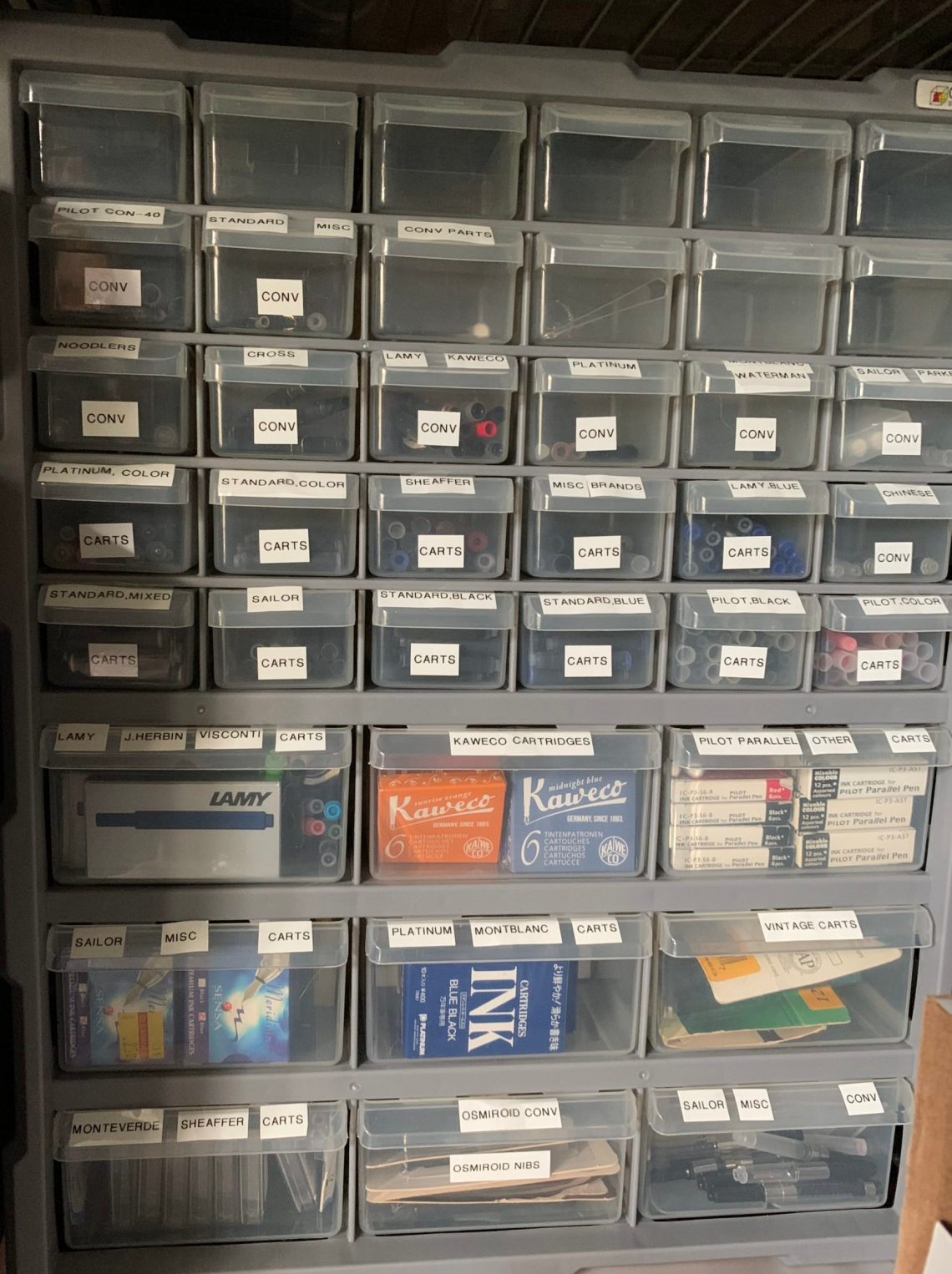
I love micro-organization. Unlike Laura’s Butterfly organization, once things are stored in that clear container, I tend to organize further inside it.

But this is also my downfall. I can organize any kind of collection, drawer, closet… but I often get overwhelmed. I learned through the clutter bug quiz that I needed to take a two-step approach to organizing. The first step is macro organization – putting items in general categories; the second step is micro-organizing each category.

I also learned that I need to see items. The switch to storing stuff in open shelves, clear containers and clear drawers was amazingly helpful – I finally felt like items were organized rather than stuffed in a box to be forgotten.


Applying this to planner style, it makes sense that I’ve found the Hobonichi Cousin to be most helpful – I can lay out information in several ways in this planner while keeping with my macro- and micro-orginizing routine.
As a note, I’m using a mostly blank planner. 2020 and 2021 have been bad years for filling in planners…
Near the front of the planner is a spread with 6 months to two pages. At the beginning of the year, I fill this up with holidays, birthdays, pen shows – any event that takes place over one full day or longer. This helps to give an overview of large chunks of time and I use it heavily when trying to see when we have time for trips or vacations.

The planner has plenty of space on the 2 page monthly spread to keep track of the schedules of my family of 6 – I use a multi-color pen to give each person a separate color. The monthly page is where I keep things as neat as possible so it remains easy to read.

The weekly spread in the Hobonichi Cousin is one item that I have found lacking in most other planners. During the school year, seeing activities over a full week allows us to plan carpools, work schedules, meal lists and other acts of juggling.

I use the A5 sized daily page to jot down notes, make lists or doodle. One of my favorite tricks is to keep Post-It notes nearby and stick them on the correct date when I can.

When I’ve used planners that only include a monthly spread, I haven’t had room for all the details needed. Planners without a weekly spread get too cluttered when planning out meals and those without a yearly spread have me planning a family trip too close to a pen show! Chaos. This planner lets me put everything in daily pages, organize it neatly for the monthly pages, keep track of the big picture with a yearly spread, and juggle the flow of life with the weekly spread. I can see everything and keep it all in one place and by placing paper clips on each layout, I can quickly flip back and forth between the spreads.
I hope this helps any fellow Bees out there!


 (Ladybugs) Love visual simplicity and organizational simplicity. You prefer to have all your items hidden out-of-sight. You also need fast and easy solutions, like bins and baskets without lids.


