Another week of living in our contracted worlds. The pen and stationery community continues to try to bring you pen, ink and notebook reviews and inspiration to keep you going as you work from home, try to educate your kids from a distance or continue to go to and from your essential job while staying healthy.
I have been keeping busy by trying to keep a regular schedule: exercise, getting actually dressed everyday (PJs are great but enough is enough), making meals, packing orders, and working on lots of projects from painting to knitting. I’m even trying to redesign a vintage knitting pattern.
There is nothing that says that you have to be productive, or super-hyper productive. Just getting through the days is enough right now. The article below from the NYTimes “Stop Trying To Be Productive” is permission to step back. I also want to remind you of the Library Extension which will add library availability to any books you search for on Amazon, including ebooks and audiobooks. Seek out a favorite read and step away from the barrage of news and Instagram for awhile. Grab that notebook you’ve been saving for a “special occasion” and write down all the things you want to do when you can finally get out of the house. I want a haircut, a trip to the library and to go to my weekly knit night. What’s on your list?
Pens:
- Montegrappa Mia Limited Edition Sea at Dusk Fountain Pen with 1.1mm Stub (via The Pen Addict)
- Comparative Overview: Pilot Capless – Metal vs Wood (via Scrively)
- Lamy Persona Comparison (via Dapprman)
Ink:
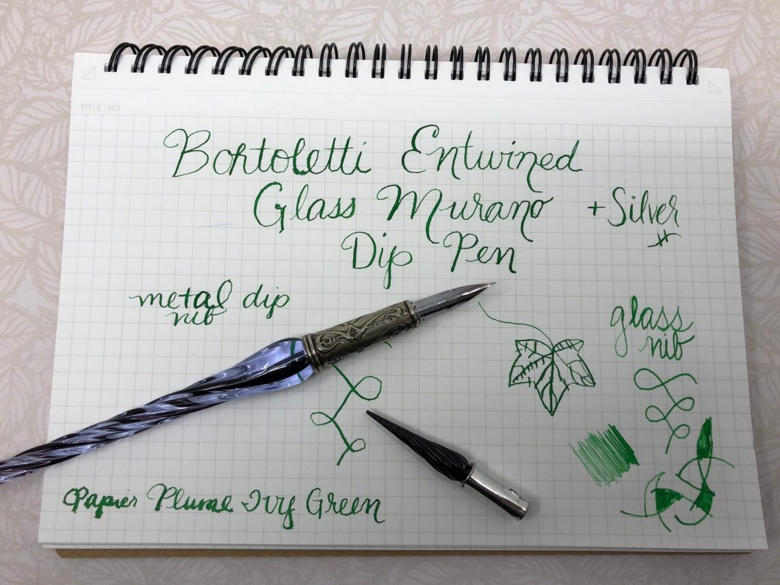
- Easy Ink Swatches with Col-o-ring Dippers (via Rediscover Analog)
- Diamine German Exclusive Sheening Inks (via Gourmet Pens)
- Diamine Inkvent Blue Edition (via Writing at Large)
- Robert Oster Signature Austrialian Opal Blue Ink Review (via The Pen Addict)
- Taccia Cha / Tea Brown (via Inksharks)
- Diamine Green Black (via Mountain of Ink)
Pencils:
- What’s the Best Eraser? CWPE Investigates — Round 2 (via CW Pencil Enterprise)
- Chiseled (via Contrapuntalism)
- Wallet-Friendly Traditional Colored Pencils (via Fueled by Clouds & Coffee)
Notebooks & Paper:
- Old Diaries Full of Surprises (via Notebook Stories)
- Grids and Guides Notebook Review (via Original Content Books)
Art & Creativity:
- Ink outside, color at home (via Apple-Pine)
- Faber-Castell PITT Artist Pens: A Comprehensive Guide (via JetPens Blog)
- Paint-along video: Lindsay Weirich Tropical Breezes Real Time Watercolor Paint Along (via Quo Vadis Blog)
- Make Some Marks, You Know You Want To… (via RozWoundUp)
- 2020 Foundations Fridays 1: Revisiting my watercolour pencils (via Liz Steel)
- Hunkered Down (via Abigail Halpin)
Other Interesting Things:
- Introducing My YouTube Channel! (via Fountain Pen Love)
- A flock of 30 zines (via Austin Kleon)
- Jungwiealt Robot Component Rubber Stamps (via Tools and Toys)
- Dr. Seuss’s Fox in Socks Rapped Over Dr. Dre’s Beats (via Kottke.org)
- Wonder Fair Home Shopping Network (via Wonder Fair)
Coronavirus-related:
- Comforting coloring page: finding calm in the chaos (via Flow Magazine)
- Artists Across the Internet Make Tributes to Dr. Anthony Fauci (via Hyperallergic)
- The Quarantine Notebook (via Notebook Stories)
- A View From the Easel During Times of Quarantine (via Hyperallergic)
- Making Masks, Neighbor to Neighbor (via Mason-Dixon Knitting)
- Why You Should Start a Coronavirus Diary (via The New York Times)
- Bunker Bites (via Thug Kitchen)
- Coronavirus Creativity Guide (via Sketchbook Skool)
- Stop Trying to Be Productive (via The New York Times)


 Congratulations! I hope you enjoy your new Work/Play!