I feel as if I’m going to end up saying “This was the hardest list to do” for every single one of the Top Ten lists. In the case of desk accessories, the difficulty was in picking items that are available (in other words, not picking all vintage finds) and picking across the diverse array of “desk accessories”. I could do ten cases, ten staplers, ten rulers, ten erasers and then pause and ask myself, “Do those count as desk accessories?” So, bear with me… these are my favorite non-writing tools in that they are the most frequently used.
- Raymay Clam Pencase: The Raymay Clam Pencase has rocketed to the top of my EDC list. Even in my current work-at-home situation, the Clam Pencase is perfect for moving my non-fountain pen tools around the house in a way that is tidy and completely usable. It doesn’t require a large footprint on any work surface and makes it easy to find the various pencils, brush pens, markers, etc that I use regularly and take with me from room-to-room. ($12.50 from JetPens)
- Dudek Modern Goods Groove: The Dudek Modern Goods Groove sits in pride of place on my desk and holds my favorite pens and some paper (usually loose, Col-o-ring seconds) or a notepad (Rebel notepad). This beautiful solid wood block has nine holes to hold various writing tools and a slot for a pocket notebook, notecards, scratch paper or even business cards. It’s a minimalist desk statement. While Dudek is not currently is production, it’s possible to sign up to be on the Batch List for the next production run. ($59 from Dudek Modern Goods)
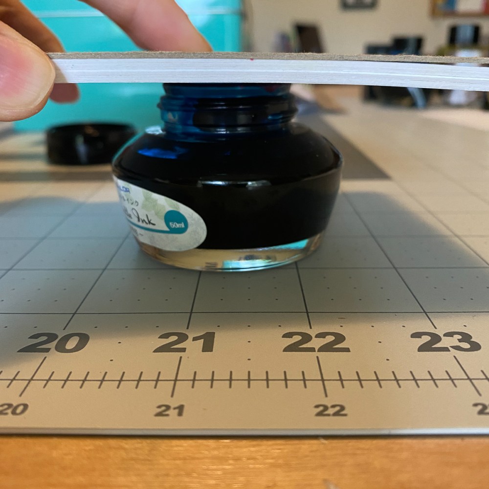
- Steel Ruler with cork back: If you want a ruler that will last a lifetime, upgrade to a draftsman quality metal ruler. I think an 18″ is a good all-around size for most purposes but having a shorter 12″ or longer 24″ is nice too. These rulers have cork on the underside that raise the ruler above the paper so if you are drawing lines with a marker, technical pen (like a Sakura Pigma Micron) or even a fountain pen, the ink doesn’t seep under the ruler. The metal edge can be wiped with a rag if ink collects on the edge and the cork on the bottom can help keep the ruler from sliding when drawing or cutting. (Starting at $3.36 from Dick Blick)
- Pilot Foam Eraser: Between me and Tina, we have reviewed a ridiculous number of erasers and the one that has risen to the top as the best all-around eraser for me is the Pilot Foam Eraser. Other Japanese foam erasers are up to the task as well but these foam erasers have replaced the white plastic erasers as best in class. ($1.65 from JetPens)
- Lead Pointer, Penco: I use this lead pointer with any mechanical pencil over 1.0mm up to 2.0mm. It’s small and portable and very inexpensive. It holds (this Kitaboshi 2mm Lead Pointer for $2.50 is comparable from JetPens)
- Binder Clips, specifically vintage Esterbrook cord clips: I favor the vintage Esterbrook cord clips but any binder clips are fine. I tried not to put vintage stuff in this list because originally the list had a whale tape dispenser and a vintage Pilot silver stapler too so count yourselves lucky. I couldn’t resist the yellow Esterbrook cord clips which I found accidentally and I use to hold my notebook pages flat, mark my spot in notebooks, hold backgrounds up for photos and so much more. (variety of binder clips starting at $1.70 from JetPens)
- Letter Opener: I know this little letter opener looks like the most ridiculous thing but I keep one by the front door so I can quickly slice open all the junk mail, bills, etc and sort what can go into the recycling and what needs to be shredded and then what I actually need to deal with. When I do get a real letter from someone, I don’t want to damage any artwork on the envelope or fun postage and the easy slice action means I don’t accidentally tear anything. Sure, there are those fancy sword-style letter openers but since this is an actual blade, it slices cleanly. I have had two or three floating around the house for years and the blades are still sharp enough to do an adequate job with my daily mail. (a 3-pack is available for $4.29 from Amazon)
- Allex S-165F Office Scissors with Fluorine Coating: I have tried to convince my husband that these Allex scissors with the flourine coating are better at resisting sticky residue than the other scissors floating around the office but he is not convinced. Eventually, I will wear him down when he is having to scrape tape goo off the other scissors, I will have my day of scissors reckoning. Until then, take my word for it. These scissors look good, cut well and don’t get sticky. If you do a lot of collage work, cutting tape for packing or just don’t want to accumulate sticky goo on your scissors, these are a good investment. ($18.50 from JetPens)
- Bone Folder: A bone folder is something that looks a little arcane but trust me, once you’ve creased paper with a bone folder, you will not look back. Especially if you find yourself folding more than a few sheets of paper. If you’ve ever ended up with a sore thumb nail from repeatedly creasing paper, you needed a bone folder. If you were curious, most bone folders are not made out of real bone anymore. Some are made from Teflon and other materials. This one is actually made from horn and was purchased in Arkansas several years ago. If you’re curious about how to use a bone folder, CreativeBug has a demo video on YouTube on the basics of using one. (Horn folder for $13.40, Teflon folder for $11.90, Plastic Folder for $4.22 and a genuine bone folder for $6.79 from Amazon)
- Craft knife (technically, Fiskars Softgrip Craft Knife): The last item on my list pairs with the steel ruler and is used on a regular basis. Mr. Well-Appointed Desk prefers the retractable box cutter but I like the precision of an X-Acto blade and the Fiskars molded grip handle. As you can tell from the image above, my blade holder has seen some miles. I have stopped buying X-acto brand blades and have switched to Excel which seem to be better quality. The 100-pack of #11 blades are $26.06 at Dick Blick and should last most folks a couple years. Be sure to find a coffee can or other container to be a receptacle for used blades. Cut a slit in the lid just big enough to slide the used blades into the “used blades” container and label the container as such. Do not throw used blades into the trash. Safety tip! (available for $7.81 from Amazon or most craft supply shops)
Honorable Mention:
Galen Leather 3-Pen and 40-Pen cases. I couldn’t decide if these actually qualified as “desk accessories” and since I’d already included the Raymay Clam Pencase, I didn’t want to flood a top ten list with three cases. That said, the Galen Leather 40-pen case is my go-to storage case for the majority of my pens when I travel to pen shows. It also fits perfectly on my bookshelf so it’s out of the way and discreet. The 3-pen case is (or probably more specifically pre-pandemic was) my go-to everyday carry fountain pen case. Since I am working at home now, my fountain pens spend more time on my desk than in a case so it’s not as necessary to have a carrying case for a chosen few. But maybe someday we will all be wandering free again… (leather zippered cases starting at $39 from Galen Leather and Vanness Pens)
DISCLAIMER: The item in this review include affiliate links. The Well-Appointed Desk is a participant in the Amazon Services LLC Associates Program, an affiliate advertising program designed to provide a means for sites to earn advertising fees by advertising and linking to Amazon. Please see the About page for more details.