By Jessica Coles
Last week I presented a post featuring an overview of the Taccia Lip color ink collection, rather than focusing on a single ink in the line. Since several new ink collections have come out recently, I decided to again present an overview – let me know if you enjoy this type of post!
This week I am focused on the new Manyo collection made by Sailor. This is an ink manufacturer that seems to put out a new ink almost daily, especially store-exclusive inks for small stores in Japan. Their Sailor Studio inks are so popular that certain colors are still very difficult to find in stock.
However, the Sailor Studio inks were surprisingly small (20mL). That makes this newest line up even nicer – large 50mL bottles ($21.33 for 50mL at Pen Chalet).

These Manyo inks are surprisingly large compared to the Sailor Studio bottles – 2.5 times as large. That’s not where the similarities end, though. Two of the Manyo inks (Haha and Nekoyanagi) have been compared to Sailor Studio 162 and 123 (two of the more popular colors). I found these colors to be similar and to demonstrate similar multi-chromatic characteristics, but not similar enough to choose one over the other.

Other Manyo inks remind me of Sailor Studio colors – Akebi and Sailor Studio 653 are similar although Akebi is brighter. I love the brightness of Yamabuki.

Nekoyanagi is the first Manyo ink that I knew I had to get. However, Yomagi has been my favorite to use for taking class notes. It shades beautifully and has mid-level red sheen.

Kikyou has an understated sheen – not shiny, though. The sheen presents more as a secondary color than a shine. Sumire is a beautiful cerulean blue with a hint of sheen as well.

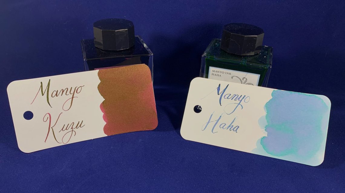
Kuzu is another ink that has a muted sheen. Haha is the best name ever for an ink. The halo color is a greenish teal – a color that is all around difficult to describe.
Here’s a big family photo of the Manyo inks!

As I stated above, Haha is a very difficult ink to compare and to show. It does have many of the same properties of Sailor Studio 162, but the halo colors remind me more of Sailor Studio 264. Shading is in line with Papier Plume Lake Michigan Winter, but the purple is close to Vinta Maskera (the photo two below).

Manyo Nekoyanagi is closely related to Haha, but less confused. Nekoyanagi is very close to Vinta Maskeraand Ya Ching Eternal Love, but it contains quite a bit of teal in the undertones. The teal does show as a halo in some writing.

Manyo Akebi is a beautiful bright purple-ish pink with a huge amount of muted sheen. The sheen moved between greenish-gold and dark brown and is very present in all writing. The underlying bright color is almost surprising when it peaks out.

Manyo Yomagi is a favorite of mine for writing. it moves from dark to light quickly and has a bit of a red sheen. I’ve been writing with it for three weeks now and I love it.

Manyo Kikyou is a close match to Monteverde Blue Velvet Cake but the sheen is very muted. A great work-safe blue-black.

Sumire is not quitet as bright at ColorVerse Supernova, but a deeper color than Pelikan Edelstein Topaz. The shading is beautiful.

Manyo Kuzu is close to Akebi is writing, but the color underneath is burgundy rather than a purple-ish pink. The muted sheen is gold-brown.

Yamabuki is a highly shading orangish-yellowthat reminds me of Diamine Amber butt the darker portions (and in writing) looks more like Diamine Marigold.

All of the Manyo inks are on the wet side of normal (only slightly) and behave like other Sailor inks I have encountered – easy to use, beautiful colors and shading, not water-resistant, no feathering or bleeding on fountain pen friendly paper. I am very happy that I own the whole set now! I’m also thrilled with the larger bottle size. One of the best differences between the Sailor Studio inks and the Manyo inks – Manyo inks are much easier to obtain in the US!
Tools:
DISCLAIMER: Some of the inks used in this review were purchased by me, while others were provided for the purpose of this review. Please see the About page for more details.