When I saw the Kala Nostalgia Abstraction inks I was fascinated by the muted look of the colors. When I saw that the inks were marked as “pigment inks” my curiosity was piqued. So, I ordered two bottles.
I was most interested to try Monogolian Sandstorm. Over the years, I’ve always leaned towards a misty lavender ink and if it was waterproof (which most pigment inks are) that would be a double bonus.


Mongolian Sandstorm, like the other Kala inks come in a 30ml glass bottle that is packaged in a paperboard box. The cap is embossed with the Kala logo which is a lovely touch.

The oddest thing about Mongolian Sandstorm is that the ink is darker when wet and then lightens as it dries. I wracked my brain trying to remember if there was any other material that behaved this way and the only thing I could think of was gouache.

The most unpleasant thing I noticed about Mongolian Sandstorm was that it is wetter than most inks. So much so that it made my Japanese style EF appear almost like a broad. Above is a writing sample image showing another pen with the same nib next to Mongolian Sandstorm. The line weight difference is pretty ridiculous.

I tried the pen on a bit of Tomoe River paper to see if the results would improve but the writing is equally indistinct.


The two photos above are close-ups of the logo doodles I did. The top image is the version I did on the Tomoe River paper and the lower image is on Rhodia. The lines do not bleed but are still blobby.


I have two other hazy purple inks that are very similar in hue though they are not pigment inks: Pen BBS 270 and 346. Pen BBS 346 is a little bit darker but #270 Raspberry Milkshake is almost the same color, just not waterproof. Raspberry Milkshake is also a wetter ink. Pen BBS #346 is darker but a dry ink. It would perform better with a little bit of White Lightning. (In PenBBS, #226 June Pearl and #315 Ice Lake are shimmer versions of similar colors if you prefer sparkle in your inks.)

Rohrer & Klingner Sketch Ink Jule is a good alternative if you’re looking for a waterproof hazy purple, though it is a little warmer with more red in the ink.
Overall, I’m not a fan of the Kala Nostalgia Abstraction inks thus far. It’s just not what I was hoping for.
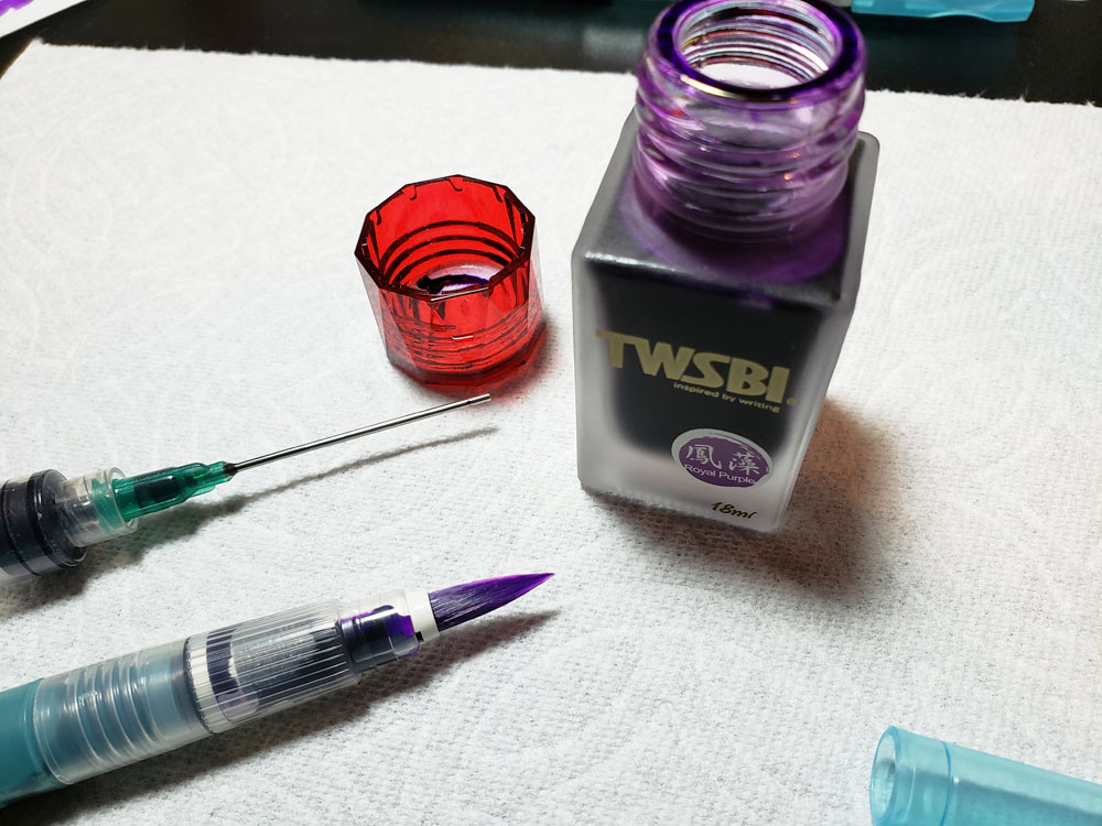
Tools:
- Paper: Rhodia Uni-Blank No. 18 with 7mm guide sheet
- Pens: Midori bullet pencil modified dip nib holder with Zebra G titanium nib ($33.50 per 10-pack), Acrylic dip nib pen (Approx. $15), Wing Sung 3008 EF and Wing Sung 698
- Swatches: Col-o-dex Rotary Cards ($15)
- Ink: Kala Nostalgia Abstraction Mongolian Sandstorm ($17 for 50ml bottle)
DISCLAIMER: The items included in this review were provided free of charge by JetPens for the purpose of review. Please see the About page for more details.