Vinta Inks are the newest collection of inks to roll up on the shores of the US thanks to the keen eye of ink maven Lisa Vanness at Vanness Pens. Coincidentally, Vanness Pens is currently the only vendor stocking the ink. Vinta Inks are made in the Phillipines and the line currently features a range of 20 colors: 15 standard, shading/sheening inks and 5 shimmering inks ($12.50 each).

Each ink ships in a 45ml brown glass bottle, packaged inside a white cardboard box. The packaging is lovely and the brown glass has an apothecary vibe while also protecting the ink from light. The only downside of the packaging is the ink names printed on the bottles and boxes is minuscule and in a script face, exacerbating the legibility issues.
Regarding the inks specifically, I think the ink can be grouped into a couple categories beyond how Vinta organizes them. In the sheening inks, there are several inks that really do sheen but others that are more traditional shading inks, and then there’s a third group that mimic the ever-growing category of “magic” inks (a term coined by Nick Stewart regarding the Sailor Studio inks). And finally, the separate category of the shimmering inks.
Sheening:

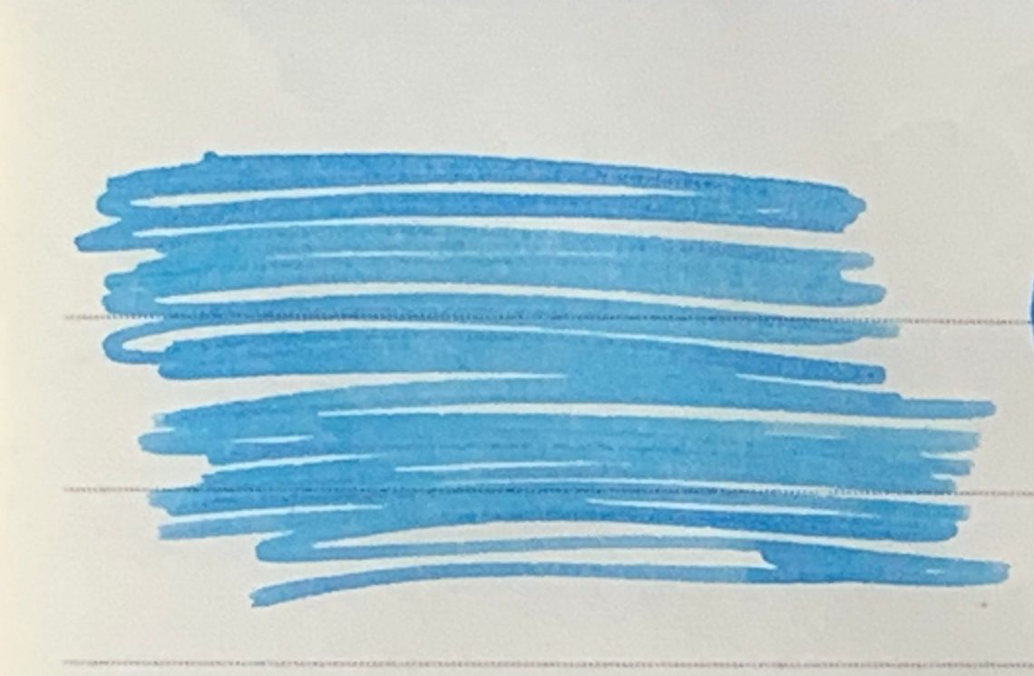
There are four truly sheeny colors in the line, three are super sheeners. Andrata is not as sheening but is still a deep, dark color. The other three are, to steal a term from the cosmetics industry, dupes. Sundungo Sikatuna is a dupe for Krishna Jungle Volcano and Dugong Bughaw and Maharalika are dupes for Organics Studio Nitrogen. Dugong has slightly more of a red-pink sheen than Nitrogen or Maharalika. But, IMHO, it’s a matter of preference which you’ll prefer if you like that sort of super-sheening blue, Dugong of Maharalika as they are fairly similar once they are in a pen.


When comparing Sundungo to Jungle Volcano, both inks sheen from olive green to fire red-orange depending on the light. The two photos above show both inks with light hitting them at various angles.
Shimmering:

In the shimmering inks offered by Vinta, only Julio features a silvery/opalescent metallic chip. The other four colors all use a gold flake. In Santa Cruz, which is a bright orange, the gold chip fades into the color but in the darker colors like Piloncitos and Kosmos Blue, the gold flakes are much more evident. Julia is a very pale orchid pink shimmering ink that is also a bit of a “magic” color as it reveals its true tone as it dries.

Julio is pictured above.

A close-up of Julia in natural sunlight.

Kosmos blue shown above in full sunlight. Pretty cosmic!

Piloncitos really comes alive when light hits it.

Finally, Santa Cruz definitely evokes orange-y sunrise colors.
The metallic particles seem fairly small but I have not had the opportunity to test these extensively to establish if these are easier to distribute the particles and easier to clean than other shimmer inks. So, like with all shimmer inks, proceed with caution in using the shimmer inks the first time out.
Standard Shading:

In the standard shading inks, the most popular colors are Lucia Deepwater (a medium blue with gray shading), Leyte Sea Kelp (a medium dark olive green) and La Union (a deep red magenta). There are two yellow shades as well, Hanan Sunrise which is a golden shade with a slight green undertone and La Paz (not pictured, the only one I didn’t get a bottle or sample unfortunately as it was sold out originally. It’s back in stock now) which a bronze yellow. Finally Carlos Emerald, a very deep forest green which shades only slightly due to the darkness of the color and Karnival, a medium green with a bluish undercast.
I love Lucia, Leyte and Karnival from this set.
Magic Inks:

Magic inks are the newest category of inks — inks that change color as they dry. The most notable inks currently available that display these charateristics are the Sailor Studio inks but Vinta has four in their line.
The most popular of the Vinta magic ink colors is Maskara by a long shot. It goes down more of a purple-y grey color and as it dries becomes more bluish and reveals it’s pinky shading. While Maskara is not exactly Sailor Studio 123 or 150, it is definitely in the ballpark. It’s less expensive and much easier to acquire.
Sirena is a more green grey that becomes more vibrant as it dries, revealing a sandy shading. It might be similar to Sailor Studio 162. Armada is a muted grey-green/teal but darkens as it dries which intensifies the colors. Perya is a pale sky blue with a lavender undertone when dry. (I’m sure there are colors similar to both of these in the Sailor Studio Ins but I don’t have access to the full swatches in person. Take a peek at Nick Stewarts swatches or Kelli at Mountain of Ink and see if you spy a similar ink.)

The above swatch is a close-up of Armada. There is a whole array of deep sea colors in this ink from reddish purple to turquoise.

This is a swatch of Maskara completely dry. It dries to a vivid reddish purply blue. So many tones!

This is Sirena (don’t tell the other colors but this one is my favorite). It is 100% mermaid magic containing shades of green seas and pinky sand beaches.

This is a close-up of Perya. This ink writes very lightly but dries to a vivd aqua with hints a purple.
Be sure, after looking at the close-ups, to scroll back up and look at the writing samples again so you can see, in the writing, the nuances of these closes-ups, in the writing.
While the sheening and shimmering inks from Vinta are immediately eye catching, these magic colors are the truly stunning colors to me.
Finally, Vinta Inks donates a portion of the profits that it earns to Teach for the Phillipines to give writing kits to kids. So, on top of creating beautiful ink, Vinta is committed to making a difference in their community.
Tools:
- Pens: Dip nib holder with Zebra G titanium nib ($33.50 per 10-pack), Acrylic dip nib pen (Approx. $15)
- Swatches: Col-o-Ring Ink Testing Book ($10)
- Brush: Princeton Neptune #4 Round ($7.16)
- Ink: Vinta Inks ($12.50 for 30ml bottle)
DISCLAIMER: The items included in this review were provided free of charge by Vanness Pens for the purpose of review. Please see the About page for more details.


 Tina Koyama is an urban sketcher in Seattle. Her blog is