Inkmas: Day 2, Kyo-no-oto Urahairo 08 and Keshimurasaki 09

Inkmas: Day 2, Kyo-no-oto Urahairo 08 and Keshimurasaki 09

12 days of Inkmas

By Jessica Coles

Day 2 of the 12 Days of Inkmas!

Today I am showing not one, but two new inks on the market.  Urahairo 08 and Keshimurasaki 09 (each sell for $28.00 for 40mL) are new colors made for the TAG stationery store in Kyoto, Japan. This line of inks is a series produced with the intention of replicating dye colors traditionally used in Japan.

I first saw these inks in an online post using both Urahairo and Keshimurasaki together and I fell in love with both.  I (not very patiently) waited for them to come to the United States and found them at Vanness during a Black Friday sale.

Urahairo translates to something like “the pale color on the underside of leaves”.  (I don’t actually read, write or speak Japanese, so I am trusting others for this description.)

The name is perfect for this ink – it brings to mind the light, dusty green of sage leaves or the color on an aspen tree when the leaves are just beginning to grow.  Urahairo is a pale ink. With dusty or pastel-ish shades, it’s hard to know ahead of time if it will be dark enough to read using a nib size that is reasonable.  I can handle nibs up to a medium and sometimes a broad while still writing normally, but with anything larger, I can’t read anything I’ve written in my normal handwriting. I have used Urahairo with a fine and extra fine nib and have had no problem with legibility.

To give you a bit of an idea how Urahairo compares with other colors, I’ve laid it out with 4 other inks.  De Atramentis Fir (the same color used for De Atramentis Jane Austen) is very close in color and tone.

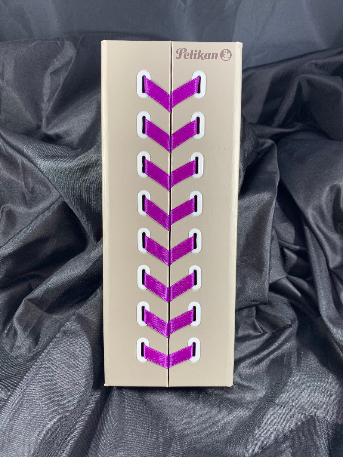
Now for the second ink, Keshimurasaki 09 (the numbers following the name indicate their position in the ink series). The packaging for all Kyo-no-oto inks is amazingly luxurious with letterpress print and thick paper that reminds me of heavy watercolor paper.

That helps to describe the ink colors as well. Both Urahairo and Keshimurasaki have the feeling of watercolors; undersaturated colors that darken significantly when more layers are added.  Don’t mistake that for how the ink performs when writing, however.  Kyo-no-oto inks are known for being dry.  Both 08 and 09 are dry inks (referring to the way the ink flows out of the pen). But neither ink is nearly as dry as their sibling, Hisoku.  I found both Urahairo and Keshimurasaki to do well in pens when I selected nibs that were slightly wider than I usually choose.

The color of Keshimurasaki is difficult to classify; it is somewhere between blue-black and purple grey. I knew that murasaki translated into purple.  Keshi means something around ruin or off or not. As with any language, though, translating the parts doesn’t really give the meaning of the word.  According to an Instagram post by @atsaichu, the color describes a vat of dye that was meant to be purple but was ruined by too much heat.  That’s quite a mouthful to put into one color! Off-purple may be the best short description.

Each time I thought of an ink that was close to 09’s color, I was surprised by how wrong I was. It was enough to make me suspect that the color changed every time I looked away. Rather than describe the color, here are the comparisons:

Although the price of the Kyo-no-oto inks is on the expensive side, I believe they are absolutely worth it. The colors are unique and beautiful on any paper. The pens I have filled with Urahairo and Keshimurasaki are in my daily carry pens and will stay that way for quite a while.

Here’s some of the splotches from playing with the inks and mixing a bit!


Disclaimer: All items used in the review were purchased by myself.  For more information, see our About page.

Link Love: Just the links ma’am!

Link Love: Just the links ma’am!

Gift Guides:

Pens:

Ink:

Pencils:

Notebooks & Paper:

Art & Creativity:

Other Interesting Things:

Inkmas Day 1: 3 Oysters, Dancheong

Inkmas Day 1: 3 Oysters, Dancheong

Welcome to Day 1 of our annual “12 Days of Inkmas”! Laura is going to start the season with an appropriately celebratory red ink from Korean ink maker 3 Oysters. Stay tuned for more inks as Inkmas progresses. Happy Inkmas! — Ana


Review by Laura Cameron

It wouldn’t be Inkmas if we didn’t kick off with one of the colors of the season: RED. I just recently acquired 3 Oysters Dancheong ($18.00) and I am in love!

Dacheong is a true red, not too orange, not too blue.

In light shades, it has sort of a soft red look, and in darker saturations it is rich and velvety red. There doesn’t seem to be a  lot of sheen to this one, but tons of lovely shading.

As you can tell, I’m incredibly impatient and I smeared everything. I’ll try to improve my Inkmas game!

In terms of reds, I find Dancheong similar in intensity and hue to Mont Blanc Corn Poppy Red and a little like Shakespeare Red. I pulled out the Monteverde Ruby, but it’s clearly too orange.

I’m excited to have this beautiful red in my collection!


DISCLAIMER: Some of the items included in this review were provided free of charge for the purpose of review. Please see the About page for more details.

Notebook Review: Coffee Cup Notebooks

Notebook Review: Coffee Cup Notebooks

By Jessica Coles

Coffee is an essential part of my life.  Most of my coffee consumption at this point in my life comes from a mug although I have gone through countless cups in the past.  Especially at pen shows. So the jump from used coffee cup to paper seems like a great connection to make.  Based on past experiences with recycled paper, however, I was worried about feathering and bleedthrough with fountain pen ink.  So I was happy to receive a pack of these notebooks to try them out and see what they could take!

My first impression of the Coffee Cup notebooks (approximately $18.80 from Back Pocket Notebooks) was quite favorable.  The notebook covers are made from 380gsm paper in a color called Moon Extract.  The name of the color could inspire an entire review on its own.

Each cover in the set of three notebooks came with a different design, and each design is incredible and inspirational; each of the three designs was first created by the artist on coffee cups.

Inside, the 120gsm paper is printed in a cross-grid pattern using a light gray ink.  Each book contains 18 sheets (36 pages) that are staple bound into a single signature (all sheets are folded one inside the next).

Inside the front cover is an explanation of the cover artwork from the artist, Rob Draper.

The inside of the back cover explains the project between Rob Draper and the paper manufacturer, G.F. Smith. I apologize for the cover being pulled away from the staple in this photo — it was taken after I’d been using the notebook for over a month and I have a tendency to fold the cover back on itself.  I also throw this into a bag (NOT into a pocket because pockets are too small for everything) with a pen clipped to the cover (the cover is thick enough that the pen stays clipped, too!) However, this is the only place I see any sign of wear and tear!

The big question, however, is how the paper stands up to fountain pen ink. I ran several tests below with a variety of writing instruments. (The smearing of the Caran d’Ache ink was my fault. Cats and fountain pen ink are not a great combination.)

The Sakura permanent marker soaked into the paper and made the texture look somewhat blurry and the “o” and “t” on Pilot 912 feathered somewhat.  Other than those two instances, there were no issues with writing from any instruments.  The paper does not allow inks to show sheen. Another characteristic I noticed here is the texture of the paper; it is fairly toothy in a way that I found very pleasant.  Writing in pencil on this paper is amazing, as was writing with the 14kt Franklin Christoph nib.  I didn’t notice the texture as much with the other tests.

Looking at the reverse side of the test page, some of the fountain pen ink can be seen ghosting through, but this only comes out in the photo.  During tests, I could not see these marks.

The J. Herbin Amytheste ink bled through a bit in the section where I laid down three layers of the ink, but not during normal writing. I was shocked when the writing from my Pilot 912 did not bleed through at all – that pen puts out a lot of ink!

All ballpoint and gel pens did very well in the test and while the Pentel Sparkle Pop pen shows through, I’ve found that it is up there with Sharpie markers.  It goes through all paper.  I was impressed that Pentel writing stayed crisp and dried quickly. I would not advise using alcohol-based inks on this paper (Sharpies, permanent markers) since it does come close to bleeding through as with the Sakura marker.

Overall, I would absolutely recommend these notebooks.  I love supporting recycling efforts when I can and this is a great way to combine recycling with fountain pens.


Disclaimer: The set of notebooks in this review were provided free of charge by Back Pocket Notebooks for the purpose of this review.  All other items used in the review were purchased by myself.  For more information, see our About page.

Notebook Review: Shizen Journal

Notebook Review: Shizen Journal

The Shizen Journal (16.2cm x21.3cm or 6 3/8″ x 8 7/16″ though the actual paper is 6.25″ x 8.25″) is a PU leather hardcover notebook with a magnetic, folding closure and rounded spine. Beneath the protected edge is an elastic pen loop that comfortably holds a medium-sized fountain pen. Inside, the paper included is 80gsm and a combination of grid, blank and dot grid pages — 64 pages of each for a total of 192 pages. It’s a notebook with three styles of paper in one book!

shizen journal dot grid

The paper is a creamy, natural white and the rulings are grey with 5mm spacing for both the grid and dot grid. There is a margin around each page and dots at the top to note the date or time or other coding as you see fit. The blank pages in the center of the book are completely blank.

shizen journal grid and blank

There is no indication or divider between the sections of paper but, as shown in the photo above, the paper migrates from graph to blank to dot grid.

shizen journal back cover

The only branding is on the back of the book — a subtle, debossed logo. There is one ivory satin, ribbon bookmark with unfinished end. It feels like an attempt was made to finish the end but it is already fraying.

shizen journal pen test

The paper is not super heavyweight so my expectations for pen fidelity was not super high.

shizen journal reverse side

I first tested some sketching tools — gel, rollerball, pencil and some drawing inks. The only show through or bleed through issues were with the drawing inks which was to be expected.

Shizen Journal FP tests

So, I went ahead and tested some fountain pens. I had a range of pens from EF to a Pilot Parallel and a couple that turned out to need ink (not the paper’s fault, obviously!). The flex nibs had some bleeding issues but everything else wrote decently. Some inks that may be more absorbent might bleed a bit so this is definitely a notebook where Japanese ink and Diamine may be the best options.

Shizen Journal FP tests

There was a good deal more show through and some bleed through but the notebook was not excessively expensive so using only one side of the paper is not the worst thing.

Overall, it’s an interesting notebook. I like the three styles of paper in one book — I can take notes, bullet journal and sketch in one book I just wish the paper was a tiny bit more fountain-pen friendly to withstand not just fountain pens but drawing inks and other materials. The magnetic closure is  nice and creates a clean, professional-looking notebook that feels appropriate for the work environment.

I could not find the notebook on the Artist & Craftsman website though I purchased it in store here in Kansas City. If you have a branch of this art supply shop near you, I recommend that you pop in and check out their assortment of notebooks, sketchbooks and journals. They have a great selection as well as a good assortment of Japanese drawing and calligraphy pens, markers and more.

Ink Review: Pilot Iroshizuku Ina-ho

Review by Laura Cameron

Pilot Iroshizuku Ina-ho is the final bottle of ink that I purchased from Jesi at the St. Louis Pen Show (backed up much?).  I was very intrigued by this one since Ina-ho translate to “rice ear.”

Ina-ho is a brown gold color, named as such after the fields of rice ears that turn golden before harvest.

This one doesn’t have any shimmer or sheen that I can see, but tons of lovely shading that ranges between a light gold to a darker brown. In most of the written applications (with a pen nib) the ink comes across very gold. It’s only in darker applications (ink drops or q-tip swabs) where it comes across as a dark brown.

In terms of color comparisons, I didn’t have a ton in my ink “stash” that looks like Ina-ho. Most of my browns are way too brown, and the few golds I have are much lighter.  My closest match was probably Colorverse Gluon, notwithstanding the sparkle.

Platinum Citrus Black is a smidge lighter than the light parts of Ina-ho, and even my lighter browns (Noodlers Rome Burning and Platinum Khaki Black) are too dark. In a sense, this is happy making because Ina-ho is a shade I truly didn’t have before!

Ina-ho performs as well as I’ve come to expect from Pilot Iroshizuku inks. It goes down wet, but dries relatively quickly. I had no issues with it flowing through any of my nibs.  The holidays are coming – maybe it’s time to add a gold to your list?


DISCLAIMER: Some of the items included in this review were provided free of charge for the purpose of review. Please see the About page for more details.

Link Love: Gift Guides & WTH is a Trigg?

Link Love: Gift Guides & WTH is a Trigg?

This week we have more gift guides from around the pen community (and satellites) plus two posts about the Trigg Life Mapper, a new planner on the scenes. There are two new guides from JetPens blog this week, one for heavy handed writers and an overview of fountain pen inks. If you’ve never check out JetPens resources, I recommend clicking on one or both of these links!

All our regular favorites are here too: ink reviews, notebook reviews, and more. Once again, my apologies for the delay. Hope you got a chance to listen to the Pen Addict Gift Guide episode I recorded with Brad and Myke yesterday. There’s lots of great ideas plus a special coupon code* for listeners for The Well-Appointed Desk Shop!

Gift Guides:

Pens:

Ink:

Pencils:

Notebooks & Paper:

Art & Creativity:

Other Interesting Things:

*Okay… I can’t keep a secret. If you listen to the podcast, there is a 10% off all merchandise in our shop. The secret code is PENADDICT. Code is good through 12/15/18.