This weekend, with it being May the Fourth be with You, we also mourned the passing of Peter Mayhew, the actor who portrayed Chewbacca in the original Star Wars films. Laura spent the weekend being my personal Chewbacca, keeping me entertained and full of snacks as we drove back and forth from Chicago, avoiding any Imperial entanglements.
Meanwhile, back at the cantina, Gentleman Stationer and fountain pen scoundrel, Joe is experimenting with budget fountain pens and both Pen Addict and UK Fountain Pens took Conway Stewarts out for a spin this week. Mountain of Ink has started diving into Sailor Studio Inks and there’s lots of journal keeping and bullet journaling advice in our notebooks section this week.
And in our last section this week are some real gems: Women of the Bauhaus, concept sketches for the rebuilding of Notre Dame, and Yoga Joes — to name a few.
Love to you all, until next week,
Ana, Laura, Jesi & Tina
Pens:
- Uniball Signo 207 Gel Pens (via Gourmet Pens)
- More from the Bargain Bin: KACO Retro Fountain Pen (via The Gentleman Stationer)
- Adventures in the Bargain Bin: Moonman N3 Fountain Pen (via The Gentleman Stationer)
- Ystudio portable brassing (via The Ink Smudge)
- NibGrinder Micro Architect Nib Grind Review (via The Pen Addict)
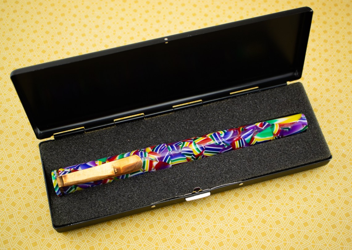
- Conway Stewart Churchill Peppered White Bespoke Fountain Pen: A Review (via The Pen Addict)
- Karas Kustoms Fountain K – Black Delrin Edition (via Alt. Haven)
- Conklin Omniflex Modern Steel Flex Nib Fun (Gourmet Pens)
- Pilot Custom 823 (via Flex & Other Follies)
- Close, but no cigar? Getting to grips with the Conway Stewart Winston (via UK fountain pens)
- Indian Fountain pens – Ebonitus Extinctus? (via Inked Happiness)
- Pelikan M101N Grey-Blue (2019) (via The Pelikan’s Perch)
- Pilot Elite 95S (Modern) (via dapprman)
- The Best Fineliners for Planners (via JetPens)
Ink:
- Conway Stewart St. Blazey Ink (Gourmet Pens)
- Sailor Ink Studio Overview (via Mountain of Ink)
- monteverde california teal (via Ink Sharks)
- Sailor Ink Studio Set 1 (via Mountain of Ink 1)
- Robert Oster Sunset Yellow Ink Review. (via The Finer Point)
- Review: Diamine Inferno Orange & Blue Flame (via Parka Blogs)
Notebooks & Paper:
- The joys of keeping a diary (and how to stick with it) (via Flow Magazine)
- Unconventional advice: Don’t schedule time for journaling (via Polar Pencil Pusher)
- How to Journal Your Past – Present – Future (via Quo Vadis Blog)
- Week 3: The Promise (The Bullet Journal Method Book Club) (via Tiny Ray of Sunshine)
- Week 6: Decluttering your Mind (The Bullet Journal Method Book Club) (via Tiny Ray of Sunshine)
- The Best Notebooks for Every Use, 2019 Review (via JetPens)
- Vintage Travel Diary Notebook Journal (via Notebook Stories)
Art & Creativity:
- Scenes From Award-Winning Literature Crafted With Hand-Cut Paper by Zim & Zou (via Colossal)
- Bold Line Drawings Layered on Top of Deconstructed Images of Fruit, Flowers, and Animals in Tattoos by Mattia Mambo (via Colossal)
- Bicolor Lessons in Values (via Fueled by Clouds & Coffee)
- Product Review: Winsor & Newton Studio Collection Watercolor Pencils (via Fueled by Clouds & Coffee)
- ShinHan PASS hybrid watercolour-gouache (via Jane Blundell Art)
Other Interesting Things:
- The Pen Show Experience (via heymatthew.com)
- Seattle day 1 haul, or why Kinokuniya is like a crack den (via Polar Pencil Pusher)
- Anderson Pens Pen Flush (via Anderson Pens Blog)
- Envelope Liner Alert Stamp (via Letter Writers Alliance)
- Celebrate summer—and Moms!—with FREE May 2019 digital wallpapers (via Think.Make.Share.)
- How to start a book club (via Flow Magazine)
- Theo Inglis takes us on a visual journey of Mid-Century Modern Graphic Design (via Creative Boom)
- Chewbacca Behind The Camera: Adorable Behind The Scenes Photos Of Peter Mayhew During The Making Of Star Wars (via Design You Trust)
- “Yoga Joes” Green Army Men Toys Encourage People To Find Inner Peace (via Design You Trust)
- 13 Concepts Showing How The Notre Dame Spire Could Look After Renovations (via Design You Trust)
- Norway’s Proposed New Passports Are Beautiful (via Kottke.org)
- Amber Vittoria collaborates with Rollie to create shoes based on personal, feminist-focused stories (via Creative Boom)
- Bauhaus Girls: a visual exploration of the groundbreaking school’s most underrated members (via Creative Boom)


 I saw a bit of variation in the larger nibs, but in general standard writing with a fine or medium nib resulted in a nice light gold that is fairly easy to read.