Review by Laura Cameron
Last weekend I had the great fortune to get to accompany Ana to the Arkansas Pen Show. I went to help her work her booth, and help other vendors out in general, and of course to look and shop!
We drove down to Arkansas on Thursday and arrived late in the afternoon. First destination: pen mecca, Vanness Pens! I had never gotten to see the store in person and it was so much fun! I immediately started a shopping basket (ooops!)

Although not fountain pen related exactly, one of the first things we did was get ourselves outfitted with Pen Show water bottles!

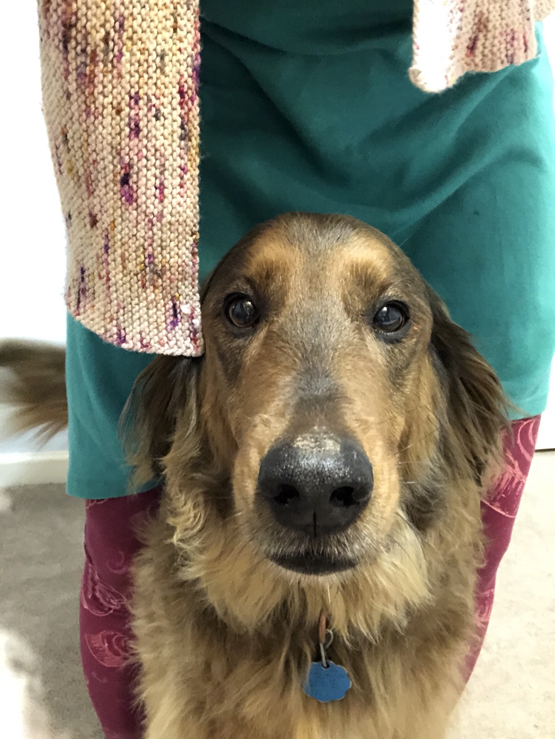
We also got to meet the Vanness shop dog!
After spending several delightful hours at the store, we grabbed dinner with friends and then went to bed early to prepare for pen show mayhem!
Friday dawned early, and with the aid of Starbucks, we had the Well-Appointed Desk booth up and ready to go fairly quickly.

Of course that left us a bit of time for hijinks!

Friday passed fairly quickly, but I did have time to poke around the show floor and see a few of the vendors. We were just down the way from Shawn Newton from Newton Pens. Arkansas is Shawn’s home town show, so he brought the goods! I managed to hold off until Saturday afternoon before I bought a pen, but I went back over to his table multiple times to check out all the lovely colors.

Patrick from Papier Plume also took a couple of tables at the Arkansas Pen Show. I really enjoy their ink, but I LOVE looking at all their wax stamping and sealing supplies.

Patrick also brought along their new Limited Edition Mardi Gras “The Mystic Krewe of Voodoo” pen. This 12 pen run with barrels created by The Herbert Pen Company, Sequel Nibs by Regalia Writing Labs, and gorgeous coconut shell details (and a coconut shell box!)


Friday Ana and I closed up shop early (oops!) and headed over to Vanness Pens for an open house evening. In truth, I was honorary store staff, running to get ink samples from the back room all night, so I didn’t get to enjoy the whole party, but it was a great time! The highlight of the evening was that Michael Sull, who was giving classes at the Pen Show, joined us. He talked about paper and gave demonstrations and was absolutely lovely.

Another fun part of the evening were the prize draws, including a new Esterbrook Estie donated by Kenro!

The party was great, but by the time it was over we needed a late dinner and BED!
Saturday came too early again, but we got ourselves up and armed with more Starbucks headed in for a full day at the show. Traffic was steady, but I still had time to wander some more.
I discovered a new-to-me pen maker, Hinze Pen Company, who had a stunning array of handmade pens. I didn’t manage to shop with them this time, but I see a Hinze pen in my future.

Next to the Hinze Pen Company booth, was the Kenro booth and Cary Yeager, Mr. Fountain Pen Day himself! In addition to picking up my show button, I also got a gander at the Montegrappa Montegrappa!

You always find a few curious sights at a pen show. This Medieval Toxic Walnut ink was an oddity that Nathaniel Cerf from The Pen Market had to share on his table. Stay tuned for an upcoming review!

The highlight of Saturday afternoon was getting to chat with lots of vendors as traffic slowed down. We even got to see an adorably tiny pen from our booth neighbor!

Well ok, maybe the highlight of the day was my fountain pen purchase – my first Shawn Newton pen! I went back and forth on whether I wanted teal or purple, but when all was said and done this one that reminds me of toasted marshmallows followed me home. I love the pen sleeve too – designed by Liz Newton. And I found the perfect ink – Robert Oster Toffee Brown!

Saturday night was a more relaxed gathering at Vanness – just a few of us and some barbeque with our new pens and inks!
Sunday was the slowest day at the show, and it was pretty slow. I went around to visit all the vendors again, and the one I’m sorry I didn’t get a photograph of was Dan Smith from The Nibsmith! Dan was fully booked up doing nibwork at the show, but he had a lovely selection of Sailors that I ogled more than once. One of those is going to follow me home soon!
Sunday night we tore down the booth, packed the mini and collapsed into bed. We drove home Monday and began reintegration to life after a pen show. I have to say it was a great weekend and I’d totally do it again! When’s the next show?


