
Thanks to everyone who entered to win the Ranga from Peyton Street Pens. We let the random number generator do its thing and and the winner is Karen!

Excellent choice Karen – we hope you enjoy your new pen!
Thanks to everyone who entered to win the Ranga from Peyton Street Pens. We let the random number generator do its thing and and the winner is Karen!
Excellent choice Karen – we hope you enjoy your new pen!

This week brings us FAKE cat photos (Really? Do we need fake cat photos? If the world is seriously lacking in cat photos, I can certainly start posting more photos of the Cats That Run The Desk but honestly I thought we’d reached cat-capacity on the internet… but no. Now we have FAKE CAT NEWS! What is the world coming to?), lots of BENU pens, Van Diemans inks and news from the London Pen Show. Ooh, yeah, and the Tokyo Olympics. That’s happening too. I watched badminton, table tennis and surfing last night. Are you watching the Olympics?

We need each other. Please support our sponsors and affiliates. Your patronage will let them know you appreciate their support of the pen community. Without them, and without you, we could not continue to do what we do. Thank you!
I’m generally pretty happy with my collection of fountain pens. Truly, I have more than I need since I can only write with one at a time and I’m at the point where adding to the collection usually means I vote one off the island. The pandemic has also been a good time to explore those frenzied moments at pen shows, FOMO, and making intentional choices about what I purchase. Unlike many, I don’t have a holy grail pen I’m working up to. I have dreams of one day owning a Nakaya, but I haven’t played with enough of them to even know what model, what finish or anything like that.
I am almost exclusively a modern pen collector. While I do love the look of the Parker Vacumatics and of course I have an Esterbrook from Jessie, the remainder of my collection is modern. I love the modern acrylics and I have quite a few demonstrators. I was discussing with someone recently that I love the look of7 the Aurora 88 Demonstrator, and I do believe Aurora’s are fine quality pens, but that I can’t wrap my head around spending $700-900 on a plastic demonstrator.

So I realize that it is entirely illogical that when I saw the Sailor Sound of Rain series I plunked my money down on a pre-order. When I got the email, I absolutely could not decide which one I wanted. They are each so gorgeous in their own right. If I had enough money, I know I’d just buy all four and not make myself choose.


I selected the Spring Rain. Sound of Rain is offered only in the Pro Gear Slim model, which happens to be my favorite. The barrels are matte finish, and two in the series are translucent while the other two are opaque. All have gold hardware, and a 21k gold bi-color nib. Nibs are only available in MF, which suits me just fine.


I haven’t had a chance to play with the pen too much; it just arrived on Friday. But it writes super smoothly – gotta love those Sailor nibs. Since Spring Rain is a mint green with purple finials I tried for a complementary ink and ended up with J. Herbin’s Violet Pensees. I also think something with a bit of iridescence or sheen would be fun to play on the light on droplets of water theme.

So now I need to vote someone off the island, and zip up my wallet tight. Until the next Sailor special edition that catches my eye?

I confess that I’ve had this pen in my queue for a long time. When I received it from Fountain Pen Revolution to write my review, I immediately filled it with ink. What I hadn’t expected was the RED ink that I used immediately stained the pale blue pen. What to do? So, I buried the pen in the bottom of my “to review” pile. Then, the pandemic hit and we all had a lot of other things to worry about. But I also had time to soak my pen. And lo and behold, patience and some industrial grade pen cleaner managed to get the red ink off the pen and most of the converter. Note to self: clean your pens more regularly.
So, here is the long-awaited review of the Fountain Pen Revolution Himalaya V1 Chrome in Peacock Aqua Acrylic (Note to potential buyers: If you like highly saturated ink colors, maybe choose one of the darker acrylic colors to avoid staining issues. Learn from the “Mistress of Disasters”.).
As mentioned, this is an acrylic pen with chrome trim and can feature either a standard nib option or the FPR Flex nib. These peens are manufactured in India for Fountain Pen Revolution. FPR also adds a custom ebonite feed to help improve overall ink flow.

In order to create the flex, the nib is split all the way down below where it is held into the grip section. The cut outs on the side are designed to help the nib flex further.

There is an o-ring seal between the grip and the body. I suppose it would be possible to eyedropper the pen, if you so desired. However, knowing how much the cap and grip stained from my own inkcident, I would tread carefully before considering this course of action.

Pictured above are two of thee push-pull converters from FPR. The one at the top is brand new and the one at the bottom is stained red from use. From what I understand, this staining of the converters is fairly common and should not be cause for concern. There is a newer version (V2) with a screw converter that may not be as prone to staining.

The pen is lightweight weighing in at 16 gms capped and 11gms uncapped. The length is 13.5 cm (5.625″) capped, 12cm (4.6875 “) and 15cm (5.875”) posted.
It’s comfortable in the hand and can be posted without getting oddly top heavy.
I know why you’re here… you want to know if it flexes. Alright, I won’t make you wait any longer.

Indeed, it does flex. The nib I received was the flex and not the “ultra flex” so there may be more potential for MORE FLEX. We don’t need more cow bell, we need MORE FLEX.
I did not have to press as hard to get the FPR nib to flex as I have had to do with other flex nibs or soft nibs I’ve tried. Head-to-head, the FPR nib is much better and easier to use than the Noodlers for sure.

In my longer writing sessions, I did find that even with this modest flex, the feed did still choke occasionally — even with the ebonite feed. And when it did choke, it choked HARD. It took a good minute or two to restore flow. Now, this could have been the slightly drier Oster ink I was using or the fact that it is upwards of 90ºF (32ºC) here today. I often think that there can be too many variables when testing pens and inks to be entirely certain. Writing materials are not an exact science.

The feed did seem a wee bit chonky too. When I pressed down with any vigor, it would actually touch the paper creating an extra little, unwanted line. (see above and below)

I think that the FPR Himalaya, or any of their Flex nib compatible pens are a worthy investment with caveats. These are not pens for beginners. I recommend them for someone who is familiar with the mechanics of fountain pens and is comfortable with inky fingers. Because the nib may hard start, this pen is best used with a wet towel, glass of water or a small stack of scrap paper to prime your nib. It might stain so be comfortable with a pen that looks “lived in” — think of this as your “beater pen” not your pristine, buffed and shined just-from-the-car-wash. It will have a history of stains and scratches that will tell the tale of your flex writing experiments. At the $30-ish price point, it can be well-loved pen.
DISCLAIMER: The items included in this review were provided free of charge by Fountain Pen Revolution for the purpose of review. Please see the About page for more details.

Teri from Peyton Street Pens was sweet enough to send us two pens this year for review and giveaway. The first was the Miwok 2 pen that we reviewed and gave away in early June. And today we’re able to host a giveaway for the Ranga Abhimanyu Premium Ebonite pen that Ana reviewed later in June. Check out her review for more information, but the basic deets are below. Good luck and may the odds be in your favor!

THE GIVEAWAY: One Ranga Abhimanyu Premium Ebonite in Green-Yellow with a broad cursive italic nib that was custom ground by Nivardo, the Peyton Street Pens in-house nibmeister. Pen has been used for testing purposes only but was cleaned and returned to like-new condition.
TO ENTER: Leave a comment below telling us what ink you would put in your new pen! (Play along and type in something. It makes reading through entries more interesting for me, okay?) One entry per person.
If you have never entered a giveaway or commented on the site before, your comment must be manually approved by our highly-trained staff of monkeys before it will appear on the site. Our monkeys are underpaid and under-caffeinated so don’t stress if your comment does not appear right away. Give the monkeys some time.
FINE PRINT: All entries must be submitted by 10pm CST on Wednesday, July 28, 2021. All entries must be submitted at wellappointeddesk.com, not Twitter, Tumblr or Facebook, okay? Winner will be announced on Thursday. ONE winner will be selected by random number generator from entries that played by the rules (see above). Please include your actual email address in the comment form so that I can contact you if you win. I will not save email addresses or sell them to anyone — pinky swear. If winner does not respond within 5 days, I will draw a new giveaway winner. Shipping via USPS first class is covered. Additional shipping options or insurance will have to be paid by the winner. We are generous but we’re not made of money. US and APO/AFO only, sorry.
DISCLAIMER: The items included in this post were provided free of charge by Peyton Street Pens and other vendors for the purpose of review. Please see the About page for more details.

We don’t usually review Moonman pens since many seem to be copied from other established pen companies. However, this pen is different.
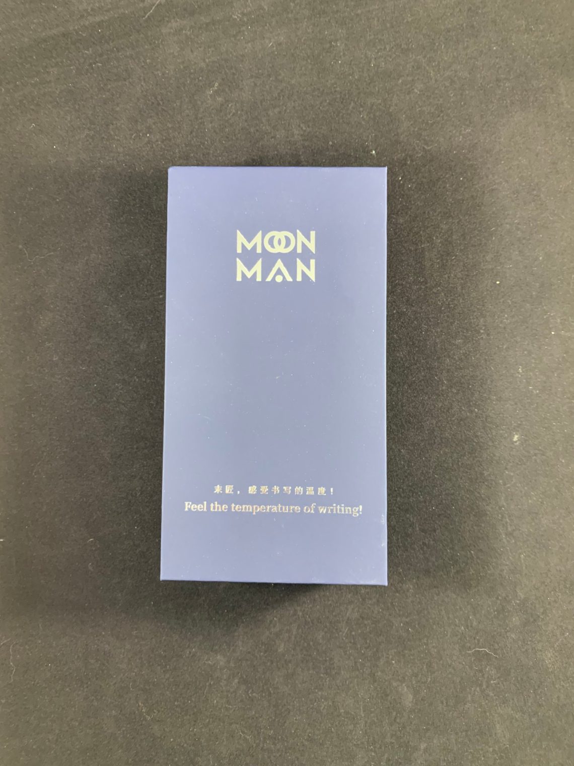
Moonman pens are usually packaged similarly. A smooth cardboard box, dense foam, and an eyedropper (at least for pens that can be eyedroppered). This pen is the Moonman Q1 mini-eyedropper pen and has a capacity of a full 2mL of ink – it is an ink bucket.

This pen is just fun. Capped, the pen is 11.2 cm (4.4 inches) long. It is 40 mm (1.6 inches) wide.

I believe the Q1 is a nod at the Japanese novelty Jumbo pens that show up occasionally.

The material available on these pens is lovely – available in clear, black, green, and brown. This is the brown version (quite a bit of green shows up in it).

I won’t be reviewing the nib in this post since Moonman pens seem to be fairly consistent in my experience. The Q1 is sold with a choice of EF or F steel nib.

The dimensions on this pen make me smile, however. It is just a tad longer than a Kaweco sport when capped.

Yet the Q1 is shorter than a posted Kaweco.

Then there’s the width. This is the fattest pen I own.

I’ve tried to show how the Q1 is fatter than my current chonker pen, the Opus 88 Bella.

The pen is quite comfortable to hold while posted, although I have hands on the smaller side. The pen weighs in at 36g empty or 38g filled when posted.

Unposted, there’s no great way to write with the Q1. I do not suggest it. Unposted the pen weighs 19 g empty or 21g filled.

Overall, I really enjoy the Moonman Q1. It cost me about $19 with free shipping from China and took about 3 weeks for delivery. I’m looking forward to bringing this to pen shows in the future and enjoy comments – what do you think?

DISCLAIMER: I purchased this item with my own money. Please see the About page for more details.

The last few weeks have seen lower COVID cases and higher vaccination rates. More businesses and events have started to re-open and loosen mask mandates, number of occupants, etc. This shift has meant trips to the local pool for some, going to a pen show for others. For me and Laura, it means our first Knit Night in person in almost 18 months. We, however live at ground zero of the outbreak of the Delta variant. It’s a place called Missouri. (Ok, technically Laura lives in Kansas but we live on the border so…) If you don’t believe me when I say its COVID-central, check out the NY Times map. We are northwest of the worst infections but I don’t trust the Delta variant to respect county lines. So, our knitting group is meeting outdoors, just to be on the safe side. Are you mingling yet?
In pen news, the Drillog Kickstarter looks interesting but a bit pricey. Mostly, I think everyone is breathing a collective sigh of fresh air before we all have to get back to work in the fall. Stay safe. Stay healthy. Keep your pens clean and your pencils sharp.

We need each other. Please support our sponsors and affiliates. Your patronage will let them know you appreciate their support of the pen community. Without them, and without you, we could not continue to do what we do. Thank you!