Eye Candy: Papier Plume Bad Bad LeRoy Brown & Lake Michigan Winter (Chicago Pen Show 2019 LE Inks)

Eye Candy: Papier Plume Bad Bad LeRoy Brown & Lake Michigan Winter (Chicago Pen Show 2019 LE Inks)

For the third year, Papier Plume is offering a limited edition set of inks for the Chicago Pen Show. This year’s offering is a riff on the extremely popular Lake Michigan Summer (from Chicago Pen Show 2017) called Lake Michigan Winter and a new deep brown called Bad Bad LeRoy Brown.

The ink comes in Papier Plume’s classic glass, 30ml bottles with wax topped caps. Lake Michigan Winter features an icy blue wax seal on the cap pressed with the signatue Papier Plume fleur de lis seal and Bad Bad Le Roy Brown has a deep chocolate brown wax seal with the same seal.

Papier Plume Lake Michigan Winter

Lake Michigan Winter turns up the density on the deep sea teal tone of Lake Michigan Summer creating a deeper, denser color. As this was one of the most popular limited edition colors that Papier Plume has released, I can fully understand why they would do a remix of this color. It’s a stunning color and I expect there will be a rush of people wanting to grab a bottle of this.

Papier Plume Lake Michigan Winter comparison

When compared with the copious amounts of teals and blue-greens already in my collection, I was flabbergasted to discover that I had few things truly similar in color. Robert Oster Morning Mist was probably the closest. I have Robert Oster Peppermint but it was too green. Other colors like Kaweco Paradise Blue  went too vibrant or too turquoise.

Papier Plume Bad Bad LeRoy Brown

Bad Bad LeRoy Brown is a deep, rich brown. In a wide application, its almost too dark but in a finer nib, it has a lovely milk chocolate quality. I find that when you find a good warm brown ink and a good cool brown ink, I don’t find that I continue to look for more. I then start looking for golden browns or more unusual hues. That said, LeRoy Brown is a good, solid deep brown.

Papier Plume Lake Michigan Winter

When compared with other brown inks in my stash, You can see the range of values. Kaweco Caramel Brown is more reddish, Smoky Quartz has an orange undertone, Diamine Espresso is definitely a cool brown, Robert Oster Chocolate is clearly red-brown and the new Lamy Crystal Topaz has more red with a green sheen. LeRoy Brown is almost a neutral brown by comparison — at least, based on these initial swatches.

Both inks will sell for $10 per bottle and will be available starting Friday, May 3 at the Chicago Pen Show. There will be 180 bottles of each color at the bottles are $10 each.


Tools:


DISCLAIMER: The items included in this review were provided free of charge by Papier Plume for the purpose of review. Please see the About page for more details.


Pencil Sharpener Review: Høvel Pencil Plane

Review by Tina Koyama

When I first became aware of its Kickstarter campaign a while back, the Høvel Pencil Plane (£50, about US $65) was not something that caught my interest. It seemed like a novelty, and because I had no experience with woodworking, it also seemed like a new way to injure myself (I’ve only just recently become comfortable with knife-sharpening pencils).

Fast-forward to a couple of months ago when a video by TJ Cosgrove (writer of the blog Wood & Graphite) was posted in the Erasable podcast’s Facebook group. (I could never make a video for this review as cool as his, so if you haven’t viewed it yet, go look now.) Mesmerized, I became curious and fascinated by this gizmo.

Curiosity, however, was not my only motivator. I do have an actual need for a device like this. Some of my favorite colored and other art pencils have barrels that are thicker than average pencils, so finding sharpeners for them is challenging. At home I can use a knife, but it’s a TSA problem when I travel. I tried the Caran d’Ache Pencil Peeler (which I reviewed here last year), and it does the job of knife-sharpening pencils without being an actual knife, but it isn’t ideal. It requires the pressure of a knife, but it can’t be pushed on in the same way as a knife. It’s a weird tool.

Perhaps the “plane” concept makes sense? I decided I would find out.

Made by Makers Cabinet (formerly called Brahman Design) of the UK, the Høvel comes in a sturdy cardboard box with a slide-out drawer.

I called it a “gizmo,” but in appearance, the Høvel is much more elegant than that term implies. Made of solid brass and “built to last a lifetime,” it’s very heavy, shiny, smooth and substantial. It comes with 10 replacement blades that are carefully wrapped in paper to fit in a die-cut slot. (Designed in London, the Høvel is machined in Shenzen, China, but I was told that the hands that counted and carefully wrapped those blades were all in London.)

Assembling the Høvel is simple, but you have to pay attention to the direction of the blade. Unscrew the thumb screw (this is an ideal design feature – no additional tool needed), and place a blade between the magnetic clamp and the slot. Replace the screw. Instructions are included on an enclosed sheet and the box bottom, but the best way to understand the assembly is to view Makers Cabinet’s how-to video.

I also found that I had to adjust how much of the blade was exposed. When I first assembled it, the blade didn’t seem to be making enough contact with the pencil, so I loosened the screw and fiddled around a bit, as instructed. This amount of exposure worked best for me:

The first pencil I sharpened was a notorious Caran d’Ache Museum Aquarelle. I call it notorious because it is my favorite colored pencil, but its slightly larger-than-average barrel diameter gives me no end of trouble in conventional sharpeners. I started with one that had last been sharpened with my electric Bostitch Quiet Sharp 6.

My first approach was to hold the Høvel with thumbscrew side up and plane against the pencil. Used in this way, the shavings collect in the indentation next to the thumbscrew. Instead of the wide petals of shavings that most handheld sharpeners produce, the Høvel makes tight, tiny curls! (I don’t know why, but they delight me.)

I managed to produce a respectable point on my first attempt – long core exposure (ideal for a colored pencil) but without a deadly sharp tip.

Another method can be used to plane with the Høvel: Turn it blade side up and place in the wooden base (sold separately £20; available in ash or cherry). Instead of pushing the Høvel against the pencil, you would pull the pencil against the blade. Although I don’t have a wooden base, I held one edge of the Høvel against the tabletop at an angle, and I was easily able to pull the pencil against the blade. (If you do this with a piece of scrap paper underneath, cleanup will be easy.) In fact, after sharpening most of my test pencils using the first method, I tried the second method, and I think I prefer it.

One reason is that, compared to knife-sharpening, very little pressure is needed to plane a pencil. When I first began using the Høvel, I was thinking about my Opinel, and I applied too much pressure. By moving the pencil against the blade instead of vice-versa, it’s easier to remember how little pressure is needed (and for me, it’s also easier to hold a pencil than the Høvel).

Next I took a brand new, unsharpened Blackwing Volume 811 pencil to Høvel from scratch. As expected, it took longer to plane the paint and wood away to get to an appropriate conical shape, but it took less time than I imagined. (If this were a review of the 811, I would have shown you all those tightly curled shavings glowing in the dark, but in this review, that would be nothing but a gratuitous distraction.)

In fairly short order, I had a nice point on the 811, too.

For my third test, I planed a Conte crayon. Like the Museum Aquarelle, the fat Conte should have a long core exposure without a sharp point. This was the easiest and fastest of all my test pencils to sharpen.

I know that lots of pencil aficionados like to get a long point on their writing pencils, and I’d seen several images of super-long points that were achieved with the Høvel, so I kept going on the 811 to see if I could achieve that, too. I think I need more practice, as I found myself simply wasting graphite instead of exposing a nice tapered core, but it gives me something to work toward.

While I was working on that, though, another thought occurred to me. Although I personally don’t mind when pencils get a little dull (they write more expressively with line variation, and I have large handwriting that accommodates dull points), I know that some people can’t stand even a bit of dullness. They seem to sharpen frequently (maybe even compulsively) to retain a lethal point. I realized that with the Høvel, it would be possible to plane only the graphite tip and maybe just a bit of the wood near the graphite to get a sharp point again. So for my final test, I found a dull Blackwing Volume 10001 on my desk. . .

. . . and tried to plane as little as possible to get a sharp point. In short order, the point was sharp, and I had taken off very little wood. Compulsive sharpeners may find that their pencils last a bit longer with a Høvel. And while it doesn’t take much time to plane off a bit of graphite and wood, you may find yourself taking longer to sharpen simply because you want to.

Final Impressions

Using a Høvel requires more engagement and presence of mind than simply shoving a pencil into my electric Bostitch (or even a hand crank or portable). As when I’m sharpening with a knife, I need to pay more attention and think about the paint, the wood, the graphite or pigment, the angle of the blade, and the amount of pressure needed. Sometimes I simply need to shove a pencil into the Bostitch to get the job done instantly. But I prefer to take the time to engage with my tools thoughtfully, and the beautiful Høvel makes that a pleasure.

In a recent Erasable podcast, Maker’s Cabinet’s Noah Bier hinted that some new products would be released very soon. I wonder what else they have up their sleeves?


Tina Koyama is an urban sketcher in Seattle. Her blog is Fueled by Clouds & Coffee, and you can follow her on Instagram as Miatagrrl.

DISCLAIMER: Some of the items included in this review were provided to us free of charge for the purpose of review. Please see the About page for more details.

Ink Review: Lamy Crystal Agate

Ink Review: Lamy Crystal Agate

By Jessica Coles

Today we continue down the path of Lamy Crystal inks.  I picked up two of these cute bottles at the Dromgoole’s table in Atlanta during the Atlanta pen show; Lamy Azurite and Lamy Agate ($16 each for 30mL).

I have noticed a trend across many ink brands towards more well made but smaller bottles. I am not sure yet if I like this trend, especially for inks that I love. However, the less ink in the bottle means it is easier to achieve an empty ink bottle; this also means less guilt about collecting multiple colors.

I love the detail Lamy put into these bottles including the band at the bottom of the bottle which matches the ink color.  On the Agate bottle, this is hard to notice since it is also the color of the metal cap.  But it is there!

In testing Lamy Crystal Agate, I chose a TWSBI Eco-T with a 1.1 nib so I could see the shading at its best and I think this was a great choice.  Agate is an ink that loves to shade and the contrast between the two tones is beautiful.

In the writing sample below, Agate has medium flow (neither wet nor dry) and it dries at a good pace to keep up with my handwriting (approximately 20 seconds). I noticed that as I wrote, the ink was a warm gray as I wrote but changed to a cool grey with green undertones as it dried.  This can be a good trait as it is fun to watch, or it can be negative if you find yourself unable to stop watching ink dry!

There was no bleeding or feathering on my paper (I used a Birmingham Pen Company Tomoe River notebook).

When you look closely at the swatch, the gray ink shows a few of its component colors; blue and green. I have found that gray is usually a very complex color in ink – not just a washed out black.

This can be seen more clearly on Col-o-Ring cards along with the shading of Agate.  There even appears to be a touch of purple at the edges of the darkest areas.

Comparing Lamy Crystal Agate to other swatches in my collection showed that it is closest to Diamine Silver Fox (one of my favorite gray inks) although a few shades darker, more in line with Diamine Graphite in darkness level.  Neither Diamine ink shows the complexity that is present in Lamy Crystal Agate, however.  To compare the shading and the mixture of color, I threw ink a swatch of Papier Plume Bayou Nightfall.

I have absolutely nothing bad to say about Agate.  The bottle is beautiful and well designed containing a reasonable amount of ink; the price, although higher than standard Lamy inks, is still at the lower end of ink prices and the ink itself is lovely. I’m glad I picked up Agate and plan to add it to my standard rotation.

I think the Lamy Crystal inks have been an amazing addition to their standard line-up and I’m glad they’ve been added in permanently.  If you pick up a bottle, you may find yourself wanting to display it as well!


Disclaimer: All items in this review were purchased by me.  For more information, visit our About page.


Atlanta Pen Show Haul

Atlanta Pen Show Haul

Once again, I took very few actual photos of the Atlanta Pen Show event. Between working behind the Vanness Pen Shop table Friday through Sunday and participating in the Pen Addict podcast on Saturday night, I had very little time to wander around and take photos. We stayed very busy.

Jesi and I had a great time. We talk all the time but getting to spend time together was also an amazing opportunity.

Atlanta Pen Show purchases 2019

When I did have a few moments to wander, I made purchases, of course! Most of those purchases happened late on Sunday when the show tends to slow down and I have a few minutes to get away from the table.

I bought the following items:

Atlanta Pen Show purchases 2019

Besides purchasing pens at the show, I also received an amazing gift from my friend Julia Skott from Sweden. You might know her better as one of the hosts of the MakeDo podcast and she was recently interviewed on Art Supply Posse. Getting to see Julia and her husband Pontis each year is one of the things I look forward to most each year. She brought a lovely assortment of her ceramic mugs this year and there was quite a bit of enthusiasm for her pen cups and mugs. There’s even talk that Julia might try to get a table next year.

Atlanta Pen Show purchases 2019

Before I left Atlanta, Brad, Myke, Tif, Julia, Pontis and I went to Ponce City Market and visited a stationery shop and an art supply store as well as eating a lot of food before heading to the airport on our various journeys. We mostly bought pencils because, why not?

Buying more stationery after a pen show makes all of us do a happy dance.

#al-staralways, #safariforever and the new #kawekoFTW buttons

Finally, Brad and I made another round of pins for our annual AL-Star vs. Safari rivalry. This year, we added Kaweco into the mix as we felt that the introduction of the Sport Frosted line for 2019 made real waves aesthetically in the low priced, entry level range of pens. Both Brad and I will try to have these pins available at any pen show we are attending this year. I’ll be at the Chicago Pen Show and will have these available. So, you’ll have to decide which is your favorite this year.

Link Love: Paper Dragons

This week has sunny yellow inks, flashbacks to the Atlanta Pen Show and some unusual pen reviews like the Omas Tokyo, the Faber-Castell Neo Slim and a Wing Sung 5502. If you saw this week’s Fashionable Friday you may have noticed a peek at some nail polish that will be available on Friday so I included the full review here from our favorite polish maven and nib tuner, Dr. Audrey Matteson from Right on the Nail. Best of all, Viking built a paper dragon for the start of Game of Thrones’ final season. I have not watched the series but I can appreciate anyone who builds a paper dragon.

Pens:

Ink:

Pencils:

Notebooks & Paper:

Art & Creativity:

Other Interesting Things:

Ink Review: De Atramentis Deepwater Obsession Black-Red

Review by Laura Cameron

When I was in Arkansas last month, I had the opportunity to spend some quality time with the Vanness walls of ink and, with some help from the friendly shop staff, I found a new to me ink: De Atramentis Deepwater Obsession Black-Red (35mL for $14.00).

Deepwater Obsession Black-Red is a gorgeous black cherry colored ink with rich intensity.

In lighter applications it is almost dusty looking, and in the darkest applications it is almost black.

In the course of normal writing, however, you don’t see those lovely shades; more just a rich red-black color.

The ink doesn’t sheen at all, and barely shades in the course of writing unless you vary the flow of ink to the nib (like with my dip nibs).

And those ink splotches? A bit red on the edges, but almost black!

The lighter shades of Deepwater Obsession Black-Red are similar to Platinum Classic Lavender Black, but are definitely slightly redder. Compared to Diamine Wine Divine, Deepwater Obsession is a little more plummy and of course it doesn’t have the sparkle of Wine Divine. Perhaps the closest in my swatch collection is Birmingham Pen Company’s South Side Market Boysenberry.

Overall I love the color of this ink, but if you’re looking for fun shading or sheening, this doesn’t have all the bells and whistles. It’s just plain old good deep black cherry red.


DISCLAIMER: Some of the items included in this review were provided to us free of charge for the purpose of review. Please see the About page for more details.

Notebook Review: Beech Tree Paper Kraft Notebooks

Notebook Review: Beech Tree Paper Kraft Notebooks

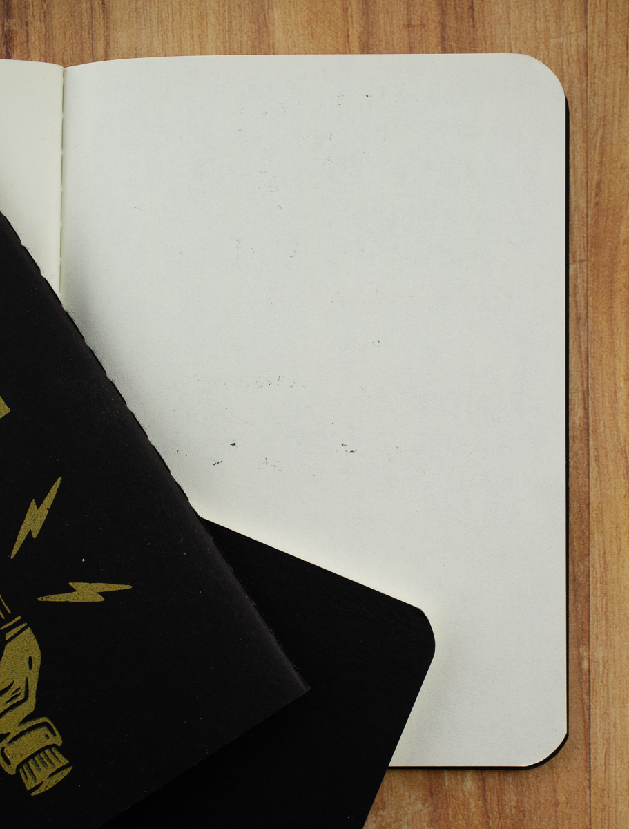
The Beech Tree Paper Small Notebooks come in a variety of sets for the plain or lined versions. The blank notebooks are available in a variety of options from single books up to 100 book packs ranging in price from $1 to $100. There are also lined notebook options but not quite as many options as with the blank books.

All the small notebooks are 3.5″ x 5.5″ with 40 pages of 24lb white paper and 100lb covers. The blank books are available with black, white, gray or kraft covers and are available with square or rounded corners.

The lined books are only available with kraft covers and square corners. They feature 0.25″ (6.5mm) lines and a 0.5″ (12.5mm) margin at the top. The lines are a medium grey. The lines are a little darker than I prefer since I do like some lighter and brighter inks and pencil but if you are using standard black or blue ink, the lines should be fine. This is why I tend to choose blank paper and place a piece of guide paper behind my working page rather than use pre-printed lined or graph paper.

Beech Tree Press mentions on their site that their notebooks are unbranded. When they arrived for review, they were wrapped with a plain paper band. Since I received mine for review I wasn’t sure if the plain paper wrap was standard or if all orders were shipped this way. As such, once the band is removed, there is no indication as to where the notebooks were purchased. If you use your notebooks quickly, and decided to order more, you may remember where you purchased them. If it takes a bit longer to use them up, you may not remember so I recommend writing in the back cover, the name of the company so that you remember that these are Beech Tree Paper notebooks.

I’m all for minimal exterior branding so that, as users, we can draw, sticker or doodle on the books to our heart’s content. However, I also appreciate being able to flip open a notebook and have some indication of who made it should I want to buy another one or should someone ask me, “Hey, where did you get that notebook?”

Beech Tree Notebooks writing test

I knew the 24lb paper was not going to perform as well as Clairefontaine or Tomoe River but for notebooks that cost less than $1.50 each, it was worth testing these for a good option for the budget conscious.

Beech Tree Notebooks writing tests

Some wider or wetter inks showed a little bit of feathering but not as bad as I was expecting. Once I got to a stub nib though, it became much more noticeable.  Fine and extra-fine nibs seemed to do okay though. Gel pens and water-based brush pens performed well too. Of course, pencils performed beautifully.

Beech Tree Notebooks writing tests

Showthrough was visible with stub nib, flex nib, parallel pen and a tiny bit with the rollerball. There was bleed through with the parallel pen and the flex nib to the next page but only dots of ink.

Beech Tree Notebooks writing test

I tested these heavier tools only because I sometimes write or draw with whatever is in my bag or on my desk which is not always the most appropriate tool. I try to carry a gel pen and pencil in my bag for sketching and for using on papers that are not fountain-pen friendly but occasionally, I turn to my pocket notebook and jot the name of a pattern, something I heard on a podcast or and idea I had while working before I forget what it is with whatever I was last using.

Beech Tree Notebooks reverse side

The brush pen had no showthrough at all.

Beech Tree Notebooks writing tools

These were the pens and pencils used in the test, in case you were curious.

Overall, these notebooks are on par with many of the pocket notebooks available on the market at a fraction of the price. I prefer blank notebooks over lined so I appreciate that but if you like graph or dot grid, you may be less inclined to purchase these. Rounded corners are only available in the blank notebooks as well so I definitely think they are the more flexible option with a guide sheet. While the paper is not 100% fountain pen-friendly, it’s on par with many pocket notebooks.


DISCLAIMER: Some items included in this review were provided free of charge for the purpose of review. Please see the About page for more details.