Review by Tina Koyama
I’m always on the lookout for opaque white pens. They come in handy for many urban sketching tasks, such as signage, fountains and small highlights. Of course, I use them most often on toned paper, especially in my favorite red Field Notes Brand Sweet Tooth notebook (no longer available at Field Notes, but possibly still available at some retail stores).

Years ago, I compared the Faber-Castell Pitt Artist Pen (2.5mm bullet point), Sakura Pen-Touch Paint Marker and Uniball Signo gel pen. More recently I looked at the Uni Posca Paint Marker (extra fine bullet point) and the Sailor Mini Correction Pen here at the Desk.
Although my general white go-to the past few years has been the Sakura Gelly Roll (0.8mm), I’m not always happy with it. It’s fine tipped and opaque enough to draw or make highlights on dark paper, and I use it that way satisfactorily most of the time. But since gel ink is water-soluble, it tends to activate watercolor pencil pigment rather than write over it, making the line inconsistent or invisible.

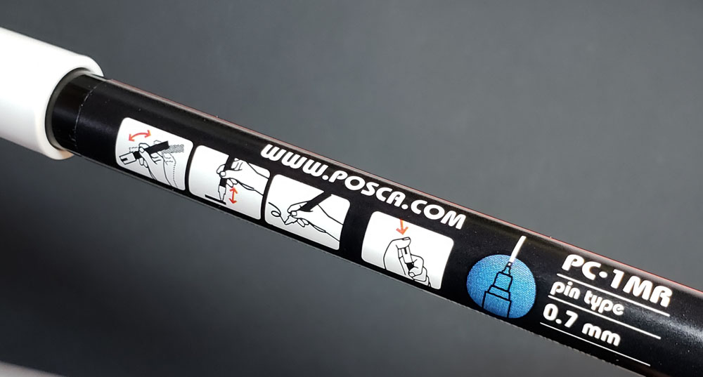
I decided it was time to try a couple of new white pens that recently crossed my ever-watchful radar: One is a Faber-Castell Pitt Artist Pen with a 1.5mm bullet nib (much smaller than the 2.5mm I had tried previously). The other is a Uni Posca Paint Marker with a 0.7mm “pin type” nib (which came in my October SketchBox, but I don’t see it sold individually there yet).


Although the Gelly Roll has a 0.8mm nib, it looks slightly finer than the Posca’s 0.7mm point, though it could just look that way because the Gelly Roll is less opaque. The Faber-Castell Pitt is the least opaque of the three, and strangely, its 1.5mm tip looks about the same size as the Posca’s 0.7. I have no idea how pen points are measured. In any case, in my scribble tests below (made in a black Stillman & Birn Nova sketchbook), I applied water on the right side, and none of the inks showed appreciable smudging, even though I know the Gelly Roll has been known to dissolve a bit when washed. The other two are described as waterproof.

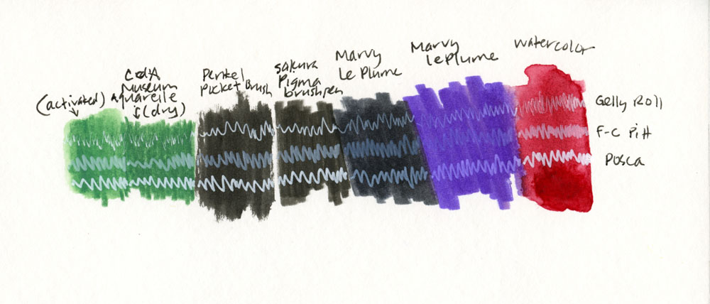
Next I ran each white pen over various water-soluble and waterproof media. All wet media were left to dry completely before I scribbled over them. No wonder I’ve been less than happy with the Gelly Roll when used with my favorite watercolor pencils – it performed the worst over Caran d’Ache Museum Aquarelles, both dry and activated. None of the three white pens wrote well over the Marvy LePlume II watercolor markers, but all three showed up much better over the two waterproof brush pens – the Pentel Pocket Brush and the Sakura Pigma. Clearly, the Posca is the winner on watercolor as well as my favorite watercolor pencils (both activated and dry).
The big inconvenience with the Posca is its “pin type” nib, which means it must be primed each time before use. By priming, I mean that you must jab the spring-loaded nib repeatedly on scrap paper for a while until the ink flows. Moreover, the ink is actually paint that must be shaken each time (you can hear an agitator inside rattling around to aid with mixing). Skip either of these steps, and the pen dispenses a colorless liquid. The priming and shaking tasks are annoying when all you want to do is make a quick highlight (sketch victims get away quickly!).
Still, the Posca’s general opacity and especially with watercolor pencils has won me over.


 DISCLAIMER: Some of the items included in this review were provided to us free of charge for the purpose of review. Please see the About page for more details.
Tina Koyama is an urban sketcher in Seattle. Her blog is Fueled by Clouds & Coffee, and you can follow her on Instagram as Miatagrrl.