The Colorado Pen Show took place only a few days ago and I was very happy to see the Dromgoole’s table at the show. In fact, I was often seen browsing through the large ink shelves they had set up. One ink that was sadly missing from the shelves was Sailor Studio since they are restricted from bringing the ink to shows, but they did bring beautiful swatch cards of each ink.

So even though the Sailor Studio inks were not present, the colors did make an appearance. And the appearance was enough for me to order more!
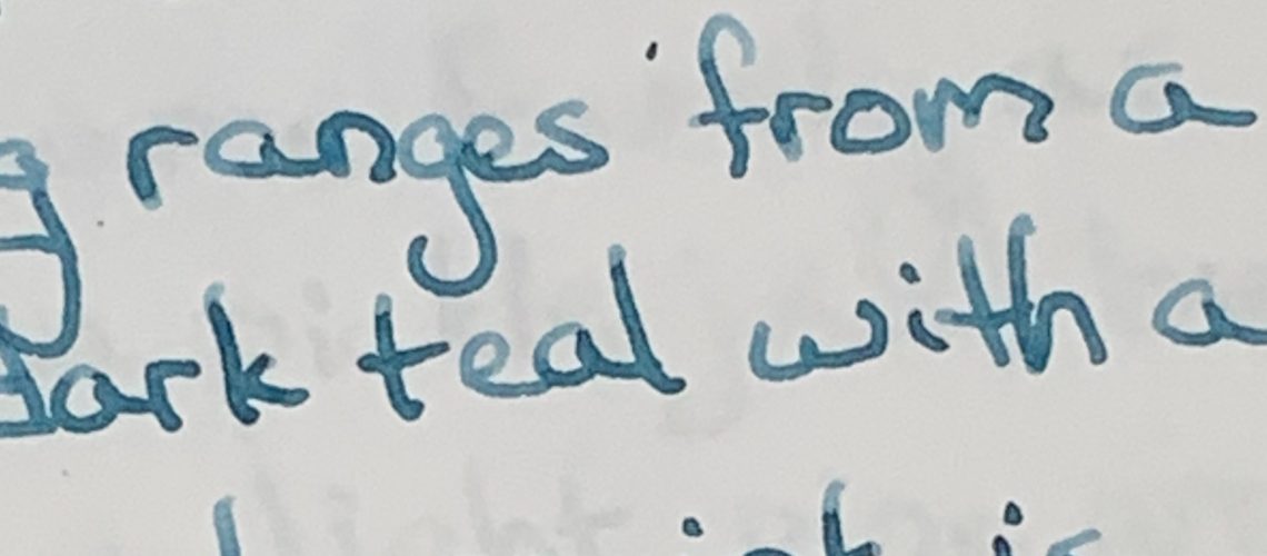
Sailor Studio 442 appears from the label to be a light to medium blue that leans towards purple. Nothing on the front indicates a special color.

The small glass bottle is the same as every Sailor Studio ink – a beautiful glass bottle, but one that is quite utilitarian. The packaging also includes several stickers with the ink number and suggestions to place the stickers on a converter so you remember which ink is inside.

My first glimpse of Sailor Studio 442 revealed a much brighter blue ink than I was expecting. A rich blue that contains less purple than the label would indicate.
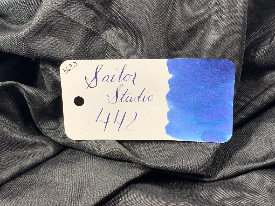
That rich blue does show well during writing, although fades a bit as the ink dries. However, the ink also shows some of its complex components as it dries – purple and a faint teal halo. This separation helps the ink from fading into the pack of blue inks available.

Color classification was tough with Sailor Studio 442, since the separate colors aren’t present in other inks. The lightest color in 442 is close to Diamine Prussian Blue. In-person, 442’s darker sections are close to Montblanc Petrol. While wet, 442 looks much closer to Penbbs #85. Like I said, a complex ink.

In writing, Sailor Studio actually shows as close to a blue-black ink which makes it a possible work-safe ink. Dry time is good (about 20 seconds) and it doesn’t smear after it dries. However, it is not water-resistant, so keep that in mind at work!

Studio 442 shades well, from a blue-ish lavender to a midnight blue. Below I was writing with an extra-fine SIG nib from Franklin-Christoph – even in this narrow stub width, the ink had no problem shading.

To see the beautiful shading in this ink, I got up close to a larger swatch. Incredible.

One characteristic of Sailor Studio 442 that wasn’t present in other swatches was a very faint sheen. It’s actually more of a halo than sheen, though. Very dark with just a hint of green. Since receiving this ink, it has been in constant use.

If you have ever tried to purchase Sailor Studio inks, you know how tough it can be to find a store selling it, pay for the shipping and wait for the slow boat to make its way overseas (unless you are lucky enough to live in Japan). Good news! Sailor has recently started allowing sales of these small bottles of sunshine by select retailers in the US. However, Sailor did put a restriction on these sales – orders for Sailor Studio inks can only be taken over the phone. Dromgoole’s was kind enough to provide this bottle of 442 for review and you can find ordering instructions here. The entire staff is great to talk to when ordering and if you are able to stop by their store, the inks can be purchased in person! Here’s a glimpse of that book full of Sailor Studio swatches:

Tools:
- Paper: Musubi Tomoe River Refill ($30-35 USD)
- Pen: Franklin-Christoph 66 Prototype with an extra-fine SIG steel nib ($175)
- Ink: Sailor Studio 442 ($18 for 20ml bottle)
DISCLAIMER: The ink included in this review was provided free of charge by Dromgoole’s for the purpose of review. Please see the About page for more details.


 DISCLAIMER: Some of the items included in this review were provided to us free of charge for the purpose of review. Please see the