This week is the week leading up to the impending lay-offs at work. So, the sign above, from a post on Design You Trust, suits my outlook to a tee. I added in a screenshot from another Design You Trust post featuring honest Valentine’s greetings. Right now, it’s snowing buckets in Kansas City and I am getting a new laptop at work (the irony of the timing!) so I am definitely not getting anything done today as I race the clock, the weather and the weirdness of setting up a new laptop. Sure, there’s some “set-up” with a new notebook but it never leaves me with the kind of dread that a new laptop does. How about you?
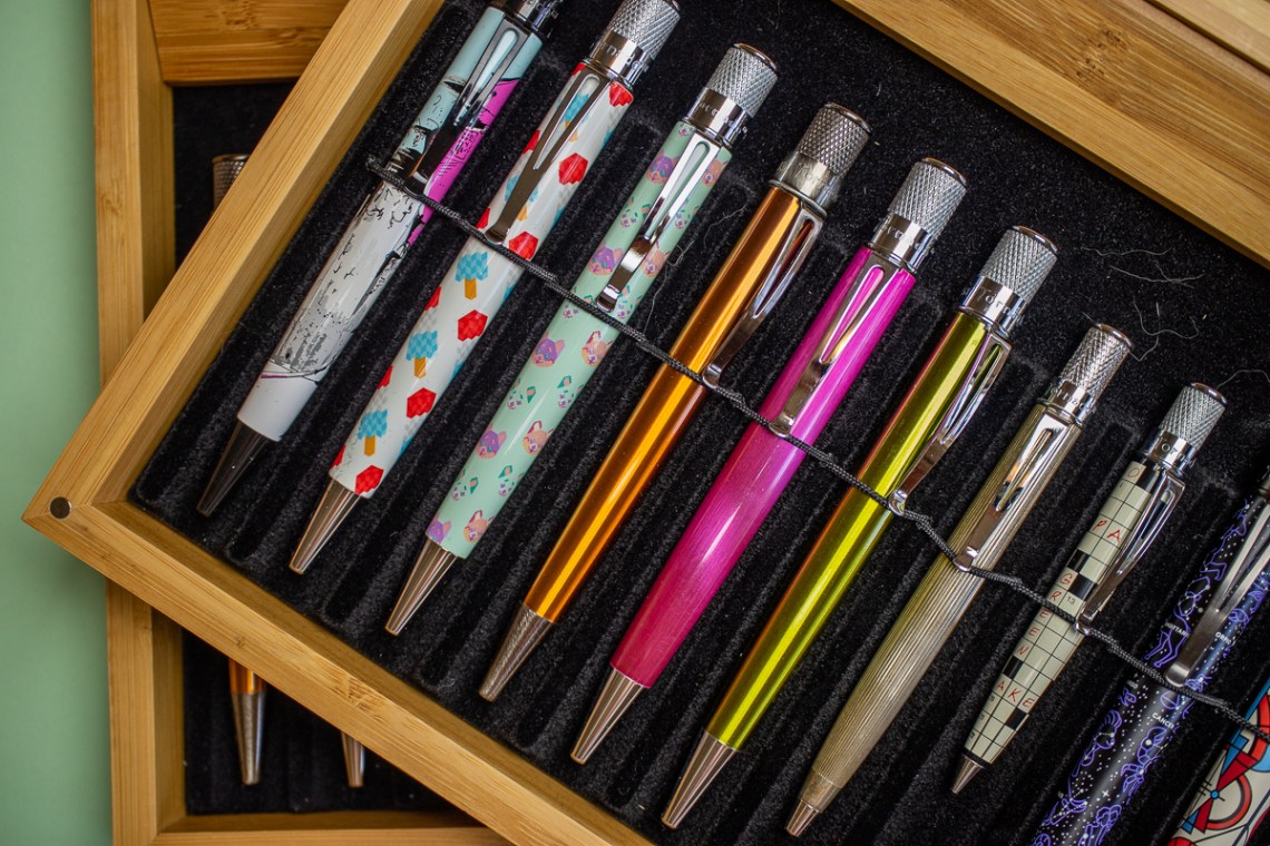
Pens:
- Papermate Compact fountain pen (via Too many pens)
- Graf von Faber-Castell Guilloche Burned Orange (via Flex & Other Follies)
- Core Pen Review: Kaweco Brass Sport (via Fountain Pen Quest)
- REVIEW: WANCHER SEVEN TREASURES FOUNTAIN PEN (via The Pencilcase Blog)
- Platinum Curidas Retractable Fountain Pen Review: Curidas vs. Vanishing Point (via Pen Chalet)
- Wancher Seven Treasures Fountain Pen on Kickstarter! (via Gourmet Pens)
- Retro 51 Vintage Metalsmith Jefferson (via Writing at Large)
- Pilot Vanishing Point (via dapprman)
Ink:
- Dual Shaders (via Mountain of Ink)
- Noodler’s Black Swan in Australian Roses (via Mountain of Ink)
- Diamine Scribble Purple (via The Pen Addict)
- Pennonia – Range Swatch Test (via FOUNTAIN PEN INK ART)
- Colorverse Joy in the Ordinary Coffee Break (via The Pen Addict)
- Blackstone’s Lemur Lime (via Inkdependence!)
- Tuesday Toolset, Top 5 Micro Gel Ink Pens Edition (via The Pen Addict)
- Iroshizuku 2020 (via Crónicas Estilográficas)
- Retro (via Crónicas Estilográficas)
Notebooks & Paper:
- Back Pocket Notebooks’ “The Night Sky” Pocket Notebook Set (via Tools and Toys)
- The diaries of writers (via Flow Magazine)
- No More Notebooks for NYC Cops (via Notebook Stories)
- How I Use My Notebooks: Yearly Goals (Resolutions) (via Writing at Large)
Art & Creativity:
- ArtBin Sidekick Art & Craft Supply Storage Review (via Doodlewash)
- Review: Kunst & Papier Watercolour book (via Liz Steel)
- Ectlectrc Pencil: Lost Collection of Pencil Drawings Reveals Trials of Patient at Missouri State Hospital No. 3 (via Colossal)
- People Are Knitting, Crocheting, and Weaving Tangible Records of Temperature Changes (via Colossal)
- Review: Paul Smith + Caran d’Ache Artist Stripe Supracolor Set (via Fueled by Clouds & Coffee)
- Review: Wacom One 13.3-inch pen display (via Parka Blogs)
- Watercolour Black Compared (via Parka Blogs)
- Book Review: Creative Watercolor: A Step-by-Step Guide for Beginners by Ana Victoria Calderon (via Parka Blogs)
- This year’s forecasted runway colour palette has been revealed by The Pantone Color Institute (via It’s Nice That)
- Think you can’t draw? You might be proven wrong (via Creative Boom)
- 17 Drawings That Prove That Love Is Everywhere And In Everything (via Design You Trust)
Type & Calligraphy:
- Top 8 Beginner Calligraphy Problems (via The Postman’s Knock)
- Variable fonts’ past, present and future, according to Dalton Maag (via It’s Nice That)
- Celebrating the unsung talents of ‘The Herb Lubalin of England’ (via Creative Boom)

Other Interesting Things:
- 20 Honest Valentine’s Day Cards. Offensive & Hysterical. (via Design You Trust)
- 2020 Valentine Printable (via Abigail Halpin)
- Productivity Tips…. (via Philofaxy)
- Wes Anderson’s graphic designer Erica Dorn explains The French Dispatch poster (via It’s Nice That)
- This Restaurant In Texas Is Putting Up The Funniest Signs Ever (via Design You Trust)
- 7 tips for a simple life (via Flow Magazine)
- The State of the Accumulation (via Fountain Pen Quest)
- Global Pen Expo 2020, Ahmedabad – a roundup (via INKED HAPPINESS)
Subscription apps – are they a sustainable business model? – 9to5Mac - Limited Edition Fatigue I: General Direction. (via PENCIL REVOLUTION!)
- Retro51 to close shop by end of 2020 (via Rediscover Analog)
- A Photo Series Shows a Deserted Shanghai Caused by Fears of Coronavirus (via Hyperallergic)
- Firefighter Figurine Helps Raise Funds for Animals Affected by Bushfires (via My Modern Met)