Wancher from Japan has just launched their Kickstarter for the True Urushi line of fountain pens. Its one of the pens in their full Kickstarter that includes an ebonite “Dream Pen” (Super Early Bird is $175/Early Bird is $185) and a maki-e pen as well. The True Urushi (Super Early Bird pricing starts at $350/Early Bird at $385) is available in black, red and blue and the tamenuri red which is a pooled dark red finish. The maki-e is a black urushi design inlaid with sakura (cherry) blossoms (Super Early Bird pricing is $1000/Early Bird is $1100) in a traditional Japanese design. The project is being launched as a chance to sell urushi pens direct to consumers from the manufacturer reducing the costs and hopefully making these unique pieces more affordable.
After talking with friends and examining the Wancher True Urushi pen, it is definitely a beautiful example of urushi. The weight in the hand is good and the finish is smooth. The cap has a spring load to help keep the nib from drying out similar to the design used by Platinum.

The transition between the grip and barrel where the threads are is comfortable though the overall pen is pretty large. The urushi keeps the pen light. Its a feeling unique to urushi pens. The finish is smooth but not slippery.

I examined the exterior of the pen closely and saw no flaws in the finish. With no decoration, there would be no place to hide if there was a bubble or scratch or other flaw and there was none that I could see.

My pen came with the German (Jowo, I think) gold nib in medium. There’s a bit of flex in it and, as a lefty, worked better if you write from an below-the-line writing position. If you are an overwriter or more of a side writer, the gold nib is probably going to flex too much and get choked by pushing it so I would recommend the steel nib instead. Its a friction fit nib so it could easily be swapped out at a later date should you choose to upgrade it.

The feed is ebonite and available in black or red. Upon photographing it with my macro lens, I was able to see it in a way I wasn’t with the human eye. The bottom three or so fins — do they look black to you? I wonder if the “red” ebonite feed is actually just painted to appear red? I wouldn’t have thought so until I took the macro photos but now I have to wonder. Regardless, the ink flowed well and the look is lovely. Will it stand up to repeated cleanings and stay red still remains to be seen but at the price point, I’m willing to risk it.

I don’t normally choose a medium nib but it provided a decent range of line variation. In a pen this size, I think a fine nib would probably be too small.

The True Urushi pen weighs 26gms capped and 18gms uncapped. Due to the lightweight quality of the urushi, even though the pen is the largest in my collection, it is certainly not the heaviest. The cigar shape does make it wider than many of the pens in my collection and after writing with it for some time, I did start to notice that it was noticeably wider than most pens that I use. For some, this wider shape will be a blessing. For me, it was just a touch too wide in the grip section to be comfortable in longer writing sections but I have VERY SMALL hands.
I’ve mentioned this in the past, my hands are kid-sized gloves small. This is probably the only issue I had. I will never have a future as a concert pianist and I have trouble with large pens. My hands are small. I don’t get to make jokes about Trump’s small hands because mine are smaller. Most adults will not have an issue but if you are also of wee petite hands, this pen might be a bit big in your hands. There. I said it.


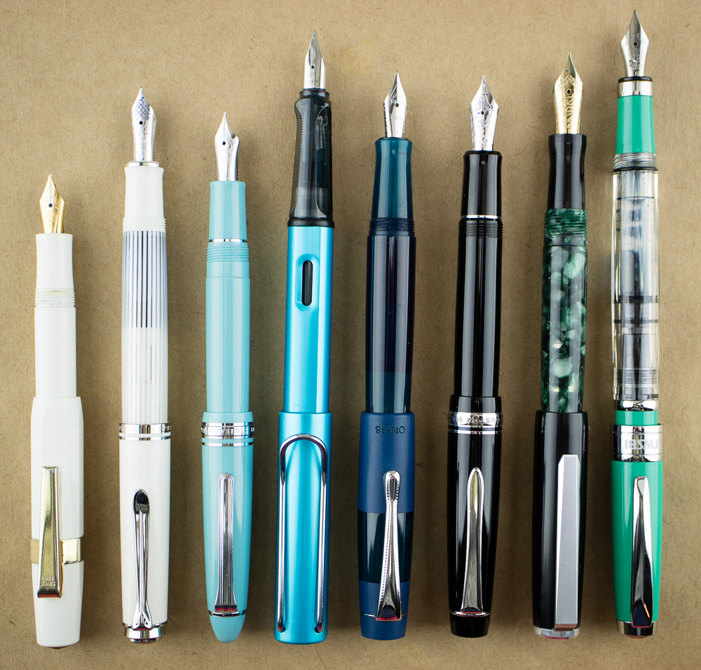
The True Usurshi pen cannot be posted but is still a relatively long pen. It’s almost as long as many of my pens posted. From left to right: Franklin-Christoph Pocket 45, Sailor 1911, Pelikan M605, Lamy AL-Star, Wancher True Urushi, Pilot Custom 912, Platinum 3776 Shungyo, Sailor Pro Gear Slim.
Addendum:

I was lucky enough to have my pal Kasey come into town last night with his Nakaya Decopod in tow so that I could do a side-by-side comparison of the Wancher True Urushi with the Decopod. It had been some time since I’d held this particular pen in my hand so being able to compare apples to apples (so to speak) was a great way to wrap up this review. Of course, its not really apples to apples as we were joking last night because, really, the Wancher Ture Urushi is just going to be an urushi gateway for a lot of people.
Physically, the two pens are quite similar is length, width and weight. Lengthwise, the pens are almost identical. The Nakaya Decopod weighs 23gms capped and 17gms with the converter so it’s a little bit lighter. The grip section is a litle bit longer and the barrel overall is a bit narrower. The way that the facets line up everytime I unscrew and screw the cap back on really is sort of magical.
The Wancher True Urushi is 90% of what people want in an urushi pen. And when you set it next to something like a Nakaya Decopod, some of that 10% becomes clear. Of course, that 10% also comes with many $100s of additional more dollars as well so 90% may be enough.
The seam between the cap and the body is not as seamless as a Nakaya but it is consistent with a Namiki Urushi pen or Platinum’s Urushi 3776 Maki-e designs which are basically cigar shapes as well.
The pooling of color of the urushi finish that clearly denotes the exterior as urushi means a lot to people. If so, the tamenuri dark red will probably be the color that will be the most appealing. But, of course, some of the various sizes and shapes of some urushi pens like the facets of the Decopod, the Piccolo, or the Dorsal Fin are what set the urushi pens apart from turned pens. The cigar shape of the Wancher True Urushi will whet the appetite for the feel of the material and the luster and sheen but the other details will have to be saved up for another time.

If you’ve never held an urushi pen in your hand before, the Wancher True Urushi fountain pen is a wonderful specimen of urushi work. It is priced to be within the reach of most fountain pen collectors (I think) for what it is. This is a handcrafted pen with a gold nib. It is priced consistently with a hand turned resin or acrylic pen or even a hand turned wood pen from a quality craftsperson. If owning an urushi pen has been on your bucket list but spending the money for a Nakaya or Danitrio seems prohibitively expensive, then the Wancher True Urushi is a great option.
The Luxury Leather Pen Case

If you purchase two pens in the Kickstarter, you can receive the Luxury Leather pen case as a bonus. Susan over on the Pen Addict wrote a review about this case in November and there was some dust kicked up about the case and its similarities to a Franklin-Christoph case. I did not know about the case when I accepted the review of the True Urushi pen review nor did I know that the case would be included in the Kickstarter. I’ve since talked to Brad about what, if anything, had happened regarding the pen case.
While yes, the shape is quite similar to the Lucky13 Penvelope, the material and weight is markedly different. The interior of the Luxury Leather pen case is soft fabric and not nearly as stiff as the material used in the Franklin-Christoph Penvelope. That said, I’d now like to discuss the case on its specific merits as its a free bonus. I know it may be a hot button issue for some people but its my understanding that due to the quality differences (this is not a stiff boot leather material) the Wancher Luxusry Leather pen case, which aesthetically very similar is not in the same league with the Franklin-Christoph Lucky 13 Penvelope.

The cover I received is navy blue pebbled leather with an ivory interior. Viewed from the side, its easy to see there would be more than enough room for taller pens than my small, dainty pen collection normally contains.

The Wancher True Urushi is clearly the largest pen in the case and fits snugly. The last five slots on the right contain my tiny Lady Sheaffer Skripserts which practically swim in the pockets as they are slim and clipless. Just to left of them is my new vintage Platinum ladies pen which does have a clip but pinched the fabric a good deal. All the pens to the left of those are modern pens and had clips and fit appropriately.
There was enough space in the pocket in the front to hold a slim A5 sized notebook and still snap the magnetic lock which would make this a good case to take to a pen meet-up or other pen-related event for pen testing and demonstrating. I wouldn’t try putting anything thicker than a notepad or slim notebook in the case though but its nice to know that you can at least get some writing material in there to make an on-the-go package out of it.

The case is a bit flexible overall but the leather feels nice in the hand and the interior ivory looks elegant and sturdy. Issues with comparisons to the Franklin-Christoph case aside, the Luxury Leather Case is a beautiful perk.
Extras
There are some additional add-ons in the Kickstarter campaign as well like a pen rest they call the “Pen Pillow,” roll stops that can be added to your pen for a more personalized design while keeping your pen on the table and two stretch goals to add additional urushi colors.
DISCLAIMER: This item was sent to me free of charge by Wancher for the purpose of review. Please see the About page for more details.


 First, my apologies for the lateness of Link Love this week. Recording


