Long weekends throw my whole schedule off. Don’t get me wrong, having an extra day off from the jobby-job is great but everything else gets scrambled. Is it Taco Tuesday yet? When is Knit Night? Is it Link Love day already?!?! Where did the week go?
What’s your best technique for getting back on schedule after a long weekend?
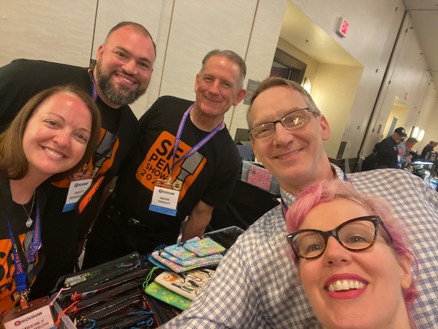
Enjoy this week’s links which include recaps from both the DC and SF Pen Show, planner reflections and tips for fixing your typewriter carrying case. That’s all you need, right?
Pens:
- White: Déjà Vu All Over Again (via Fueled by Clouds & Coffee)
- Pen Porn: Dotted Sea Urchin (via Rachel’s Reflections)
- News: M600 Red-White Special Edition (via The Pelikan’s Perch)
- What’s so special about specialty nibs? (via Leigh Reyes. My Life As a Verb.)
- Fountain pen face-off: Kasama vs f-inks (via Pen Noob)
- Four fun ways to use brush pens (via The Pen Company Blog)
Ink:
- Ink Review #777: Dominant Industry Manschurian Violet (via Fountain Pen Pharmacist)
- Cult Pens Tiverton Rust (via Inkcredible Colours)
- Robert Oster Scorpion on Maruman Mnemosyne (via Inkcredible Colours)
Pencils:
- Student-Grade Caran d’Ache Pencils (via Fueled by Clouds & Coffee)
- A.W. Faber-Castell Vintage Pencil Tin (via Writing at Large)
- Back to School with Colored Pencils (via Fueled by Clouds & Coffee)
Notebooks, Paper & Planners:
- Itoya Oasis Line Friends A6 Notebook Review (via The Pen Addict)
- Guest post series – ‘Filohax’ No.7 – Paul (via Philofaxy)
- Boundaries I: Identifying Boundaries (via Bullet Journal)
- Planner for 2024 (via Stationery)
- PAPER REVIEW: AJOTO POCKET PAPER NOTEBOOK (via The Pencilcase Blog)
- planners and life (via too many options)
- 120 Col-o-dex Cards (via Olive Octopus)
- Kokuyo Jibun Techo Covers Archive (via JetPens Blog)
Art & Creativity:
- Experiments from March 2023 (via Drewscape)
- Boulder Colors Food Waste Watercolors Review (via Doodlewash)
- N.C. Wyeth Painting Bought at Thrift Store for $4 Could Sell for $250K (via Hyperallergic)
Pen Show Recaps:
- DC Pen Show, Part Two – It’s All About the People (via Pen Boutique Ltd)
- 2023 SF Pen Show – The Funnest Pen Show, aka Not A Quick Recap (via The Pen Addict)
- San Francisco Pen Show 2023: A Weekend Whirlwind (via Dime Novel Raven)
- Unpacking the San Francisco Pen Show: A Deeper Dive into What I Brought Home (via The Gentleman Stationer)
- 2023 San Francisco Pen Show Recap: Could It Get Even Bigger Than D.C.? (via The Gentleman Stationer)
Other Interesting Things:
- This week’s scribble squad is an exercise in twos (via mnmlscholar)
- One weird trick for fixing your typewriter case handle (via The Typewriter Revolution blog)
- How to promote and build your creative business without using social media (via Creative Boom)
- The Man Who Made Everyone Look Famous: Richard Bernstein and His Iconic Interview Covers (via Design You Trust)
- Drying your plates with stationery (via Bleistift)
We need each other. Please support our sponsors, affiliates or join our Patreon. Your patronage supports this site. Without them, and without you, we could not continue to do what we do. Thank you!