If you’re getting a sense of deja vu, let me reassure you this has happened before. But last week I found out about the NEW Kaweco x Hello Kitty Opal Green limited edition. Available in Gold or Silver this is another Taiwan exclusive edition. Like last year’s Pink edition, barrel is marked with both Kaweco and Sanrio’s Hello Kitty, and the nib features Hello Kitty’s face. Last time I went for gold, but with the opal green I preferred silver. Now the only question is what ink shall I fill it with?
PS Yes I know I have a little Kaweco problem. More about that in another week or two….
Alice in Wonderland-themed inks have been popping up lately, one of them being the Ferris Wheel Press ink line FerriTales. This ink line consists of three inks that are very saturated and have a touch of sparkle (Green with Curiosity, Red Ruby Flush, and Tumbling Time Blue) and three inks that are highly shading, multi-chromatic, and sparkling with rose gold shimmer. This latter group is what I’m reviewing here today.
First, take a look at these boxes! In San Fransisco, I was stationed at a table near a window with direct sunlight shining through for part of the day. I had to move the FerriTale inks out of the sunlight to keep the reflections from blinding anyone!
The FerriTale inks are on the expensive side – 20mL bottles for $21. The bottles are adorable – a miniature version of Ferris Wheel Press’ large 85mL bottles. The bottle lid is heavy – solid metal rather than plastic.
Today I’m covering Adventurtine, Blue Beryl Tonic, and Blushing Mushroom.
First, Blushing Mushroom. The base ink color is a slightly under-saturated dusty purple with medium shading and rose gold sparkle. In keeping with most Ferris Wheel Press sparkle inks, the shimmer is fine enough that it doesn’t easily clog a pen. I had a bit of a tough time finding a second matching ink – Pen BBS #404 is close but Blushing Mushroom is darker.
On Midori MD Light paper, Blushing Mushroom is a bit lighter and it shades even more. I love how many layers this ink can show in a single swatch.
The second paper in my tests is Tomoe River paper Tomogawa #7. This is the “old” Tomoe River paper and you may see it labeled as TR7 as the paper types become more differentiated. I’ll review the newest Sanzen Tomoe River paper in a future review.
In the meantime, Blushing Mushroom ink on Tomoe River paper. The shimmer was a bit out of control here! I’ve found that shimmer and Tomoe River paper don’t agree with one another as well as other paper types. I don’t mind shimmer all over my page, but it may be something to keep in mind!
Finally, Cosmo Air Light paper. Blushing Mushroom shows a greater amount of blue on CAL and the edges are crisper – the shading isn’t as dramatic as the two previous papers in my review, but it is still present. I love how easy it is to read the lettering I did on through the swatched ink. The color isn’t greatly different, but the letters still stand out nicely.
When I first saw the three inks I am reviewing here, I thought Adventurtine was the least exciting, but it became my favorite of the three once I swatched them. It is a light grey with undertones of pink and blue plus rose gold shimmer. With a dip nib, the ink resembles graphite, while wider nibs shade beautifully.
On Midori MD Light paper, the pink undertones show clearly and the ink swatch is haloed in a dusty blue. I was pleasantly surprised at how well the shimmer showed up on this paper.
Adventurine on Tomoe River paper (TR7) is fairly unsaturated in the swatch but shows up well in writing. TR7 gives the ink a watercolor character to the swatch.
Cosmo Air Light paper brings out more of the blue undertones in Adventurine while the pink nearly disappears. The first layer of the ink looks like a watercolor wash, but the writing is easily legible – it also looks less like graphite.
Blue Beryl Tonic also shades well, with several shades of sapphire blue and grey and pink undertones and rose gold shimmer. It reminds me of Troublemaker’s Milky Ocean ink in the swatch, but in writing, Blue Beryl Tonic is closer to grey.
Midori MD Light paper shows the layering Blue Beryl Tonic can lay down. This ink can get fairly dark around the heavier areas in the swatch and haloing is dramatic.
On Tomoe River Paper, Tomogawa #7, the sparkle in Blue Beryl again gets carried away. The tone is bluer and stands out well from the page in writing.
On Cosmo Air Light paper, the ink is again even bluer. The lettering below the swatch almost pops off of the page but the shading is scaled back.
I’ve been enjoying all three of these inks since I first received them. It took a while to obtain all three since they have been selling out at several retail stores each time a shipment is received! While the FerriTale inks are quite pricy ($1.05 per mL), I do think it is worth picking up one or two of the colors. The shimmer particles are small enough that the ink flows smoothly in medium nibs or wider, all colors are clearly legible, and the bottles are adorable. Which one of the three is your favorite?
DISCLAIMER: The Blue Beryl Tonic included in this review was provided free of charge by Ferris Wheel Press for the purpose of review. The other items in the review were purchased by myself. Please see the About page for more details
I received a couple emails this week with updates to dates for pen shows through the end of the calendar year. Check out our Pen Show Schedule for more details. We have not updated the 2023 schedule yet but will try to get dates nailed down for 2023 in the coming weeks.
In other Pen Show News, Jesi and I will be at the Dallas Pen Show next weekend helping out at the Dromgoole’s tables. Jesi will continue her reign as Ink Queen and I will be her lackey. Or maybe the Dromgooles will just make me do coffee runs? Either way, you know where to find us both if you’re in the Dallas area for the weekend of Sept 22-23. Yep, you guessed it! At the bar! No seriously, we will be at the Dromgoole’s Ink Bar corner recommending ink, paper and more. Please come say hello!
We need each other. Please support our sponsors, affiliates or join our Patreon. Your patronage supports this site. Without them, and without you, we could not continue to do what we do. Thank you!
I confess that when I was contacted to review the 2023 Calendar To-Do List by Ryan McGinness ($40 available on Amazon), I squeed just a little bit. Over the years, I’ve accumulated several of McGinness’ art and design books (the most well-known is FLATNESSISGOD). I did my best to play it cool in our email correspondence, though I suppose now, the cat is out of the bag.
The 2023 Calendar To-Do List Pad was flawlessly packaged in a custom shipping box. The actual calendar came is a black, linen-finish box with silver foil stamping. You all know how I feel about excessive packaging but stay with me because there is a reason for the box so, in this instance, I am 100% okay with it.
Inside the box is a ribbon to make removing the pad easier.
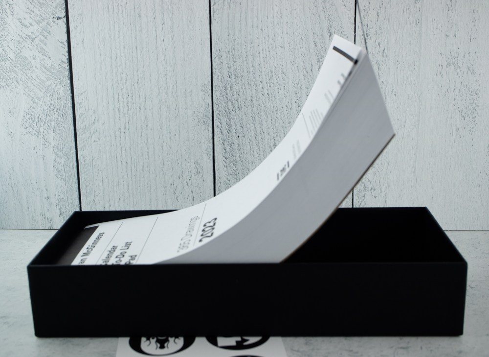
When you lift it up, you can see how chonky this pad is! The pad measures 11.5 x 4.75″ and it’s two inches thick.
Under the cover sheet is details on how to use the box after the pad is removed. It recommends that you save the box and each day, put your completed page back into the box. I recommend putting the pages facedown so at the end of the year, you can flip the whole stack and it will be in order.
Once the year is over, put the lid on the box and store it for posterity. Or have a ritual burning depending on how it all went.
I love that there is a printed, handwritten note inside from the creator explaining that he has, for years, made these calendars for friends, family and his studio. He also explains the size was selected because it is exactly half of a letter-sized sheet of paper when cut lengthwise. It’s easy to imagine that, in the early days, he was printing these pages on his office copy machine and trimming them by hand.
Each page features a graphic illustration in a black circle at the top of the page. The overall design of this chonk of paper is excellent. As a design snob, I 100% approve. Good type design, art, layout and attention to detail.
One of the other big plusses for this pad is that Saturday and Sunday are given the same treatment as the workdays. Because not everyone rests on the weekend.
Did I mention the 2.5mm gird because YES! I love it.
Testing the Paper:
I confess that I entered into testing this paper with a bit of trepidation. The paper felt very lightweight and, like most people outside the fountain pen community, the design and “functionality” of a paper good tends to outweigh the paper performance particularly when compared with how incredible picky “pen people” can be in comparison.
But once I started testing gel, rollerball and ballpoint pens, I realized I had no issues. Should I try a fountain pen? Will it make me sad?
Nope. No sadness. Fountain pen ink performed just fine. I didn’t drown it in ink but with the teeny tiny 2.5mm grid, some small stubs, fine and extra fine nibs and an italic, it passed with flying colors.
Even the view from the back… some show through but since these pages were designed to be used front side dominantly, I don’t think that’s a big deal. Of course, if you want live dangerously, you could throw Sharpie or paint pen on there but I recommend peeling the daily page from the stack so it doesn’t bleed through to the next page.
Final Impressions:
I already have a pretty specific planning set-up but I think this Calendar To-Do List pad will make a great addition. I plan on using it for a sketch-a-day, a quote-a-day, or other sorts of daily tracking that could be separate from my work/hustle/work planner.
This is a beautifully designed, field-tested day-on-a-page calendar to-do list that I would be proud to keep on my desk.
DISCLAIMER: The items included in this review were provided free of charge by Ryan McGinness for the purpose of review.
This review also includes affiliate links. The Well-Appointed Desk is a participant in the Amazon Services LLC Associates Program, an affiliate advertising program designed to provide a means for sites to earn advertising fees by advertising and linking to Amazon. Please see the About page for more details.
Seriously, Bob went to look for some printing equpiment out in the country and as they were talking, the gentleman mentioned he had some blotter stock and would we be interested in it? Um, yes. And so a deal was struck, the cargo was loaded and we started planning the best way to cut it and make it available to all you lovely folks.
The vintage blotter paper is thick, adsorbent cardstock available in two sizes: A5 and A6.
Close-up detail shot of blue marble fibers in paper
This blotter paper is white with blue marble look. It is very thick. It’s cardstock not paper. It will work great inside your journal or notebook to soak up an ink that hasn’t completely dried before closing the page.
Each pack includes 5 sheets.
A5: 5.5 x 8″ (20 x 14 cm) $10/pack of 5
A6: 5.75 x 4″ (14.5 x 10 cm) $5/pack of 5
The stock is very limited. When this batch is sold out, that is all there is so grab it quick. I don’t think it will last long.
Currently, the Blotter Paper will only be available on Big Cartel. For anyone supporting us on Patreon, check your email or on Patreon for a special offer!
Look! It works!!!
Reminder: The paper is vintage NOS so there may be some slight variation in color and texture. We quality checked it, trimmed it and packaged it so it should be the best of the best but be aware, this is OLD STOCK.
One last thing: Every order placed will also receive a blotter bookmark (while supplies last).
This post is a shameless plug for product we sell in our shop.
This year (2022) has been the year when I feel like I found “my size” notebook. I have wholeheartedly embraced the B6 and B6-ish sized notebooks (approx. 5 x 7″ or 125 x 176 mm). It’s been a very Goldilocks discovery.
For years, I thought I was an A5 lover (closer to 6 x 8″ or 148 x 210mm) but I realized that I wouldn’t take the A5 notebooks with me when I went somewhere. They were too large to fit in a small bag and took up a lot of real estate on my desk when open.
I tried the A6 size (approx. 4 x 6″ or 105 x 148mm) for several years thanks to the wide enthusiasm for all things Hobonichi but I found that size a little too small.
Despite years of notebook nerdery, it took until this year for me to discover the happy medium of the B6 size. I have been regularly using my B6 daily bullet journal/planner and have actually finished TWO notebooks at this size. I can’t tell you when the last was that I finished a notebook.
I have thrown A5 over entirely and I still use the larger size for personal journaling which stays at home and doesn’t travel. But for notebooks that need to be both useful and portable, I am 100% sold on the B6 size.
Midori and Nanami both make B6 Slim size — they shaved about 15mm off the width of the notebooks which fall into that B6-ish category for me. They are close and often provide paper options that are hard to find otherwise like the Midori LIGHT paper or the Nanami Cafe dashed grid.
At the moment though, my favorite B6-ish notebook is the Paperblanks MIDI with 120gsm paper (use the “More filters” drop down to choose paperweight). I purchase the blank unlined versions.
Have you found your go-to notebook size? What is your criteria for picking a notebook size?
The San Francisco International Pen Show arrived like an oasis in a dream. I am ready for my vacation, I am ready to see my friends and meet new people, and I am ready for that special Pen Show Magic!
From Friday morning to Sunday morning, my pen show fashion was on point
The show began for me with a delightful breakfast outdoors with Pierre from Desiderata Pens and my friend Emy. It grew into a crescendo of joy and community, that special combination of meaningful items and meaningful people. This year it felt to me as though the crowd had been uncorked from a bottle, bringing along their enthusiasm and joy.
Helping out on the pen show floor
This was the second year that I helped out at the table of Rick Propas, the PENguin. His array was in the main ballroom, in one of many aisles filled with pen, paper, and stationery offerings. It was populous and active. It’s a challenge for my senses to be sure, but I did better this time in regulating my own need for quiet breaks.
I enjoyed helping out and interacting with the crowd, talking to Rick and the other helpers, and learning just a smidge more each time about the pens.
these are the beauties I picked out from Rick’s table: Pelikan 400NN tortoise set, Pelikan M300, Parker 41 coral set
Classic pen show experiences and MAGIC!
When I wasn’t a Helper, I was an Attendee, having the Classic Pen Show experiences of reuniting with friends, meeting new people, and seeing in person shops and items one would never have the opportunity otherwise.
One such vendor is Bungbox, which readers may know is a brick and mortar shop in Japan. I was one of the lucky shoppers to buy a TWSBI Eco with real maki-e finish! I chose the goldfish design, which is ever my maki-e motif heart’s desire, and grabbed the “morning glory” inks and cute store brand notepads as well.
Two things happened relating to this:
The first thing is that my good pal Franz offered me his appointment with Gena Salorino of Custom Nib Studio, who put a “Reverse Architect” grind on it.
This is Pen Show Magic at work: I mentioned “if a nibmeister has an opening…” and Franz said “would you like this one?”.
The reverse architect has fine or extra fine line when you write as usual, but if you flip the pen upside down, the nib will write with this amazing architect grind. A ridiculously fantastic nib grind for a ridiculously fantastic pen!
Some of the detail on the pen with an example of the exquisite grind.
The second thing is one I could never have expected.
At the vendor breakfast, Kaoru and Bruce from Bungbox joined me at the table. At the tail end of a delightful group conversation (including such luminaries as Jesi from The Well-Appointed Desk, the Rickshaw crew, and Elizabeth (Emy) from Peyton Street Pens who was also my hotel roommate), Kaoru casually asked for thoughts about a special pen for next years show. To my surprise and delight, I found us brainstorming pen design possibilities together. Grabbing a notepad from my bag, which turned out to be the one I had bought from her the preceding day, I made notes and sketches. Will these sketches become a real pen? No one knows.
This is Pen Show Magic at work: connecting with people you never thought you’d meet, and being enthusiastic about the stationery we love together.
I cannot contain my joy.
Inkwash Painting Class Love
I taught my Inkwash Painting class again this year!
“Welcome to my favorite part of the show” I greeted the students, and we proceeded with two hours of brush and ink technique practice with two kinds of papers, quiet time, and the Joy of Art.
I didn’t take pictures, I was engrossed in discussing depth and line. I hope my students will enjoy this practice with all their inks for years to come!
This seems like a good place to show the inks I brought home from the show with their Col-o-ring swatches. Jesi helped me pick out the Colorverse and Sailor Manyo colors, and the Malibu Blue was a gift from a friend. Thank you, Philip!
From L to R in the swatches: Bungbox Morning Glory blue-purple and red-purple, Colorverse Under the shade, Sailor Manyo Nadeshiko, Monteverde Malibu Blue
Do you want more Pen Show Magic?
I participated in a self-made frenzy at the Rickshaw Bags table, because I was excited to get one of the new Sinclair cases, which is a collaboration with NockCo. The NockCo version I have is one of my favorite cases.
I picked out a pretty Sinclair which also happened to be a prototype, without the brand tags, and some pen sleeves to go with. I had paid for these items when Emy, enjoying the frenzy with me, opened a prize fortune cookie and won a free Coozy case. Gasp. I forgot about the fortune cookies with prizes inside. I opened one. I won a free Sinclair!
I promptly turned inside out and grabbed the Sinclair in eye-searing fluorescent green. YESSSS! This one will match my rickshaw tote bag, which is houndstooth with Flo-green piping. I can’t even.
All my pretties!
The notebooks
Of course there are notebooks. Lots of wonderful book and paper vendors to visit! My three choices here come from Curnow Bookbinders, Odyssey, and Musubi, all A5.
The Curnow book is their show special, which I used as a place to keep paper receipts and notes during the show. I will enjoy this for note taking and project plans, most likely.
Odyssey was one I had in my mind to find on the show floor after reading some reviews. They were in the atrium, and materialized before my very eyes! I had a great conversation with the creative mind behind the brand, and chose the 200-page Black Hole design with blank paper, which felt conceptually correct to me.
The Musubi pink kitty-cat book was the first notebook that caught my eye Friday morning. On Sunday morning I checked in with Daryl, who noted he had only 4 notebooks left to sell! “How is there a pink kitty-cat one still here?” I boggled, and his response was to say that while very surprised as well, he was sure it would go home with someone that day. And it did. I am that someone.
All my secrets go in here.
Fun Stuff galore
There were so many different styles of stationery vendors here. I got to meet and purchase from Angela He of Inky Converters. The Ink bottle pin color shifts from dark to light as it gets warmer!
I was admiring the wax seals from Day Art Store, and had a delightful conversation about how hard it is to find the woodpecker that you can plainly hear in the trees.
Next door was the table for Stickersters. I found a sheet with a sticker that spoke to me. It was “thinking of you” in the bottom left (photo below).
And how could I forget the Pochitto stamps, brought to us in SF at the Enigma table? But I did forget and so my helpful and kind friend Emy got me a set.
Special shout-out in the fun-stuff category to Maido. I am looking forward to hanging out with this bear and quail and riding cable cars together.
We can use the musical and artistic clips along with our special edition Uni-ball One pen set at a cafe when we’re done.
Quiet times for Art and Breathing
Perhaps my favorite bit of pen show magic is in the quiet times. My brand of after-dark in the bar is all about drawing and journal enjoyment. This year I opened up my Traveler’s Notebook and tried out pens, pencils, and chalk pastels in the Kraft inserts I had bought last year. I feel quiet and happy just looking at these.
Summary and Conclusion
As you can see, Pen Show Magic was alive and well. I am so happy.
Julia is an artist, classical musician, knitter, and lover of the outdoors. She resides in Santa Cruz, California, where she can draw Pelicans with Pelikans, and brag about the weather. Follow her adventures on Instagram @juliavdw or Twitter @juliavdw.


 Julia is an artist, classical musician, knitter, and lover of the outdoors. She resides in Santa Cruz, California, where she can draw Pelicans with Pelikans, and brag about the weather. Follow her adventures on Instagram