A kind reader sent me this Schneider Fountain Pen. Prior to receiving it, I knew very little about Schneider as a pen brand. Occasionally, I would see Schneider rollerball, gel or ballpoint pens at my local big box office supply store but I was not aware that they had any fountain pens.
Schneider is a German brand and, my best guess, is that it’s sort of the PaperMate or Bic of Germany. I don’t mean to belittle the brand. I am rather suggesting that they focus more on the standard school and office supplies, branded promotional pens and less on high-end writing tools.
Based on my research, I was able to establish that this pen is probably last year’s design in their “Voice” line. There is also a “Easy” line that looks similar in overall design besides the graphics printed on the barrel.

The pen I received came with a standard international cartridge and an empty spacer cartridge (empty with no back on it so it wasn’t simply an empty cartridge). The pen will also accept a standard interntaional cartridge converter for bottled ink.
The pen is very lightweight plastic with a slightly rubberized, molded grip section. I suspect this is definitely a “my first fountain pen” for the budget conscious. I know many German school children are required to learn penmanship with a fountain pen and I suspect if my family had grown up in Germany, we would have gotten a pen like this for my brother who would have perpetually lost his pens and not a Lamy or other more expensive pen.

The nib has some unique etched lines on it but its the nib that was really fascinating.

The nib was pretty unusual looking. On closer inspection, it looks as if the tines were folded to create a blade-like writing surface.
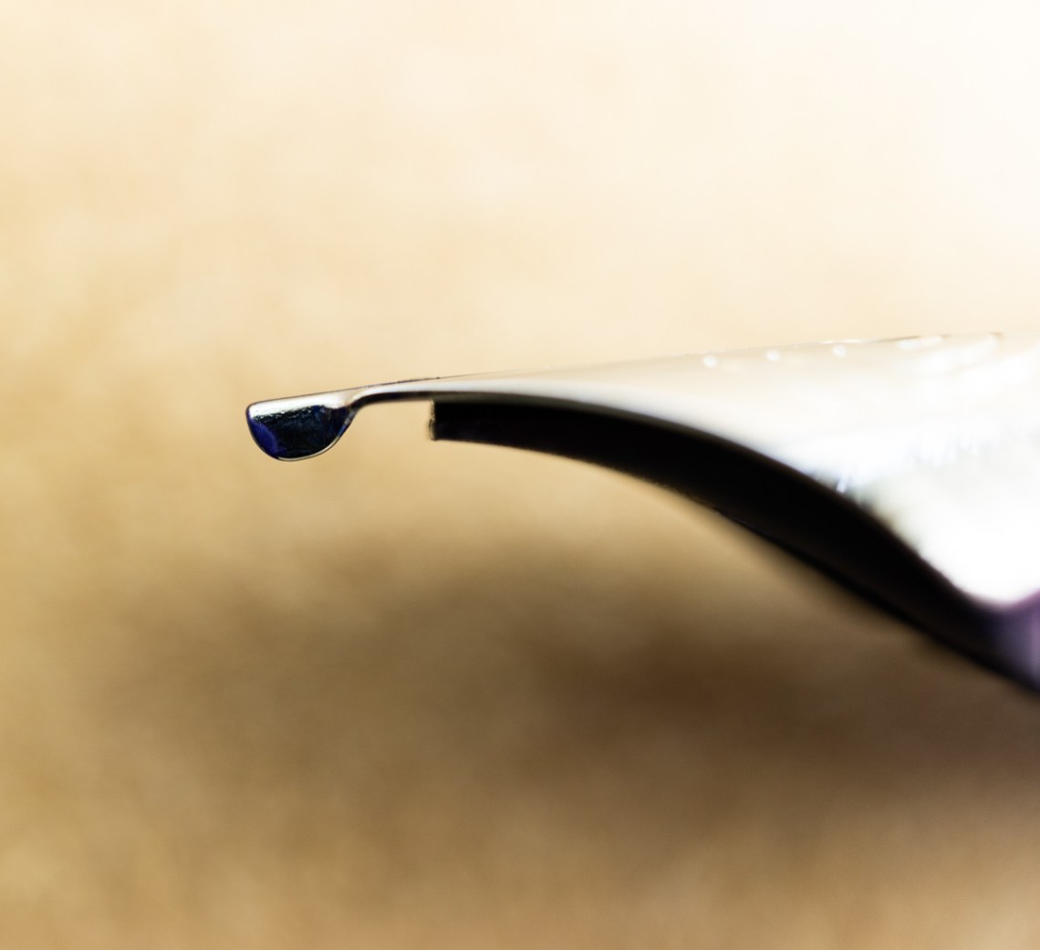
The view from the side is where you can really see the butter knife swoop.


When actually writing with this, I could really see the advantage of the unusual shaping of the nib. The Schneider pen writes very smoothly while maintaining line characteristics.

When compared to other pens (from left to right), the Schneider, Lamy AL-Star, Pilot Metropolitan and a Platinum Preppy, it’s pretty clear that the Schneider is a large, wide pen. It measures 6″ (152mm) capped , 5.4375″ (127mm) uncapped and 6.625″ (168mm) But it’s also very light weighing only 16gms capped and 10gms uncapped with a full cartridge.

Finding one of these Schneider fountain pens in the wild might prove challenging. The only option we found for purchasing this pen was through Amazon ($7.24). So, thanks to our kin reader Jean, I’d like to give this one away. I will clean it and send it off with it’s original cartridge to one lucky reader who’d like to try something a little unusual.
UPDATE: Regular reader Kelly (AKA Subgirl) dropped me a line to let me know that if you wanted a full dozen of the Schneider Voice Fountain Pens, iPenStore sells them for $29.99. If I thought Fountain Pen Day was going to be a social occasion, this might be a good purchase. Maybe you have friends or family members you could mail some of these pens?
TO ENTER: Leave a comment below and tell us what you did for the Independence Day Weekend. Play along and type in something. It makes reading through entries more interesting for me, okay? One entry per person.
If you have never entered a giveaway or commented on the site before, your comment must be manually approved by our highly-trained staff of monkeys before it will appear on the site. Our monkeys are underpaid and under-caffeinated so don’t stress if your comment does not appear right away. Give the monkeys some time.
FINE PRINT: All entries must be submitted by 10pm CST on Thursday, July 9, 2020. All entries must be submitted at wellappointeddesk.com, not Twitter, Tumblr or Facebook, okay? Winner will be announced on Monday. Winner will be selected by random number generator from entries that played by the rules (see above). Please include your actual email address in the comment form so that I can contact you if you win. I will not save email addresses or sell them to anyone — pinky swear. If winner does not respond within 5 days, I will draw a new giveaway winner. Shipping via USPS first class is covered. Additional shipping options or insurance will have to be paid by the winner. We are generous but we’re not made of money. US and APO/AFO only, sorry.
Tools:
- Paper: Rhodia Uni-Blank No. 18 with 6mm guide sheet
- Pens: Schneider Voice Fountain Pen with Medium Nib ($7.24)
- Ink: Caran d’Ache Idyllic Blue Cartridge ($4.70 for 6-pack of cartridges)
DISCLAIMER: The item in this review include affiliate links and sponsor links. The Well-Appointed Desk is a participant in the Amazon Services LLC Associates Program, an affiliate advertising program designed to provide a means for sites to earn advertising fees by advertising and linking to Amazon. Please see the About page for more details.