Over the past six years (yes, NockCo has been at this case making for awhile now) or so NockCo has made quite a few pen cases. I’ve had the honor and privilege of getting to test drive most of them. This has given me the ability to really see when and where certain cases shine. So I thought I’d help anyone trying to decide which NockCo case might be best for your needs.
As you peruse this round-up, be warned that I may show a colorway or material that is from a limited edition or is no longer in production. I apologize in advance if I get your hopes up. I used the stash of NockCo products accumulated over years.
Lookout 3-Pen Case

The Lookout ($25) is one of the most minimal, slimline cases NockCo carries. If you prefer your pens do not touch, carry only a few pens and have another solution for a notebook, then the Lookout is right for you.
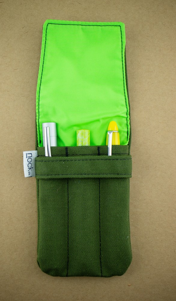
The Lookout holds pens from average size to large. Oversize pens or very long pens (Conids and such) might be too long for this case.

Sinclair Zip 3-Pen Case

The Sinclair ($40) is the Lookout with room for a Field Notes and more. There are slots on one for three pens you do not want to touch and an open slot on the other for a Field Notes-sized notebook. The open section in the middle can accommodate additional cards, receipts, a couple random pens like a Sharpie or ballpoint that you don’t mind touching, etc.

The nice thing about the Sinclair is that many folks have discovered alternate uses for it. My husband has used his for a money pouch at craft and pen shows or to store a small portable harddrive as the padding is enough to provide protection and the pouch has room for the cables and harddrive. Laura store her knitting supplies in her Sinclair. I’ve been know to fill the open pocket with pens and stuff a small notebook in the middle section. So, if you like the pens plus more and still have a small, portable carry, than the Sinclair is a good option.

Brasstown Pen Roll

The Brasstown ($40) is the multi-tool of pen cases. Inside the neat zip-up case is a multitide of options for organizing pens and accessories.

Inside is a roll-up, divided pen sleeve. Originally, I thought this seemed excessive. Why have a pen roll in a zip case?

Because you can overstuff a Brasstown. Not only can you divide your “fine pens” in the roll, your other items can be tucked to the left and right of the roll and the case will still easily zip closed. As shown above, I have filled the space on either side of the roll with fineliner pens, some business cards and a pack of stickers.

The roll, when unrolled, reveals sleeves for six pens. The sleeves can hold an array of sizes and since the pens are contained inside the zip case, both clip pens and clipless pens can safely reside in the Brasstown.
(Please overlook the condition of my Brasstown. I once had a pen explosion which lead to discovering that NockCo cases are machine washable. The more you know!)

The photo above shows all the items that were contained in the Brasstown and it was not at all difficult to zip shut. I often include other items in my Brasstown like a pipette, cotton swabs, and a vial with spare dip nibs when I travel for pen shows or go to pen club. The Brasstown is definitely a bigger case and may be more pen case than you need. Or you might need two.
Lanier/Burton A5 Pouch

The latest case available from NockCo is the Lanier A5 Pouch ($35). Originally only available as part of the Lanier Briefcase, its now available as a standalone item.
Pictured here is the Burton case available in this year’s Kickstarter and will be available at a future date. It is padded and has individual pen slots and the extra slot for paper ephemera. Inside there are three large slots for pens and I mean LARGE. (Thanks to the eagle eyes in the Pen Addict Slack Group for catching my mistake.)

The Lanier A5 pouch is a great “around the office” or “around the conference” kind of case. If you like to organize your bag-in-a-bag as well, the Lanier A5 pouch will help with that too. There are two slots for Field Notes-sized notebooks or a phone. The open section holds an A5 notebook.

I work on a large campus and often walk from meeting to meeting without returning to my desk. The Lanier A5 Pouch plus my laptop keeps me organized and well-stocked for a whole day. Though I don’t recommend the smooth matte black if you have pets. I lint rolled this before the photos and it still looks like I rolled it around on my dryer vent. Imagine what it will look like at the end of a long week? Lint city! The standard Cordura is a way better option, lintwise.
Seed Case A6

The Seed A6 ($60) (also available in an A5 size) is a pen case in the loosest sense of the word. It’s really more of a notebook case with a pen slot. However, it does hold a couple pens, a notebook and some miscellaneous items so it fits into this round-up.

The double zip on these cases are one of my favorite aspects. As a lefty, I tend to zip and unzip in the opposite direction from the rest of the world so being able to choose directions is awesome.

Depending on the thickness of the notebook will determine how stuffed you can get with your Seed case. These really work best with a more streamlined notebook and regular sized pens. The A5 case has a bit more wiggle room than the A6 case overall.
Rare & Discontinued Cases:
There are a few cases that are no longer available but that might turn up on Buy/Sell/Trade, at pen shows or might come back at some time. I thought I’d include a couple.
Fodderstack Pen & Card Case

The Fodderstack existed in a regular, an XL model and this diminutive version. The XL was large enough to hold 4×6″ cards, the regular held 3×5″ index cards and this little guy holds mini DotDash cards, business cards or… Col-o-ring cards. That’s where it really won my heart. I stuck one of my hacked traveling dip pens in the slot on the front, plus a couple cotton swabs and a handful of Col-o-ring cards and I had an instant traveling ink sampling kit.

For everyday use, I stick a Kaweco Sport and a stack of mini index cards. I luck out having a printer for a husband so I just have him give me cut scraps to fit into the Fodderstack Mini. If you like writing on index cards, I say send a pointed email to NockCo and request that they put the Fodderstacks back in the production rotation, particularly the Mini!
Sapelo Penvelope

While this is the small Field Notes-sized Sapelo that was a limited edition, NockCo does make a larger Sapelo XL ($40) that is currently available. The larger Sapelo XL fits a slim A5 notebook or miscellaneous papers and features additional pockets on the front to hold pens and a Field Notes-sized notebook. The original Sapelo holds a Field Notes-sized notebook or similar and a pen.

As a travel companion, the Sapelo is the picture of minimalism. It could double as a makeshift wallet as well to hold a couple credit cards and some cash and be the perfect “at the beach” or “going down to the cafe” companion. The closest alternative to this would be the Sinclair or the Hightower ($25).

Not Pictured:
There are even more cases that I didn’t have here at Desk HQ or that I didn’t actually own one. So, this round-up is not as complete as I’d like.
Hopefully, this round-up gave a good overview of the various NockCo cases and which one might be right for you. Maybe you need more than one, maybe you need all of them too. We won’t judge.
DISCLAIMER: Some of the items included in this review were provided free of charge by NockCo for the purpose of review. Please see the About page for more details.


 Enter the Canvo Journal. I got the idea that I could turn the Canvo Journal into a sort of scrapbook for spinning. I could use my fun sheepy washi tape to add labels into the book, and try and record the spinning details in a more complete, neater fashion.


 A unique feature is the book’s exposed spine thread knots, which look very much like the ancient Coptic hand-stitching technique I use myself. A rubbery-feeling substance protects the spine and threads.
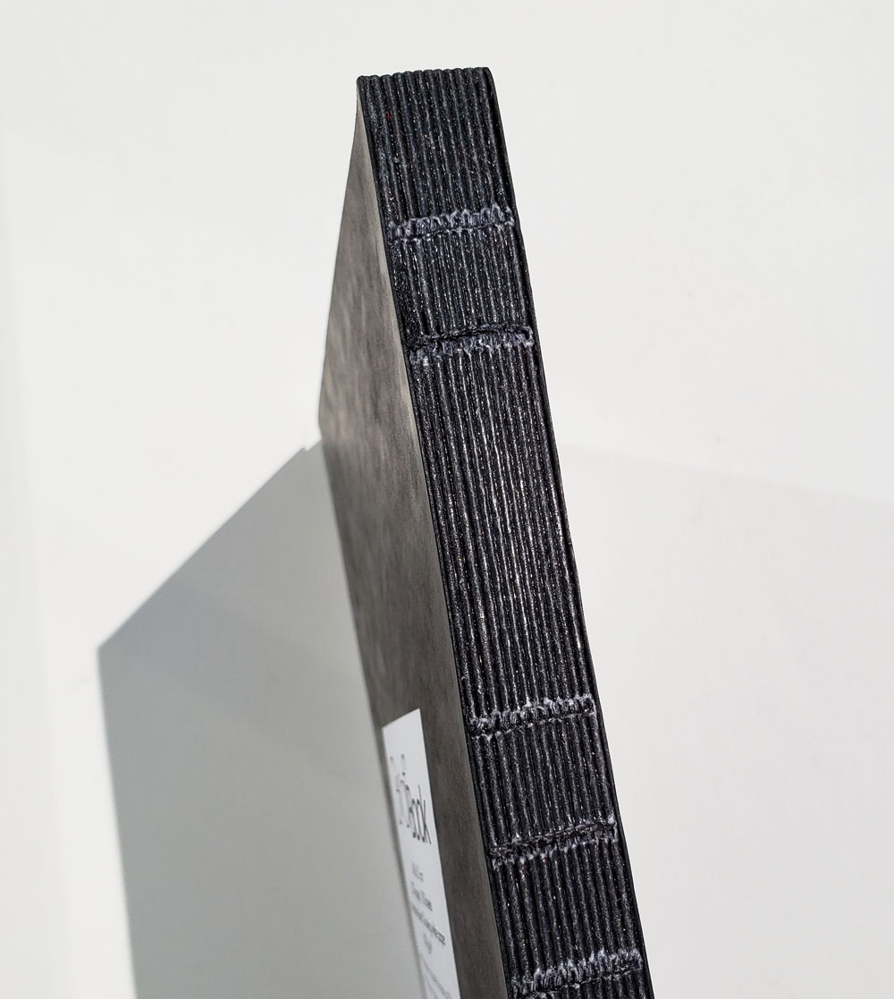


 For my test sketches, I used a
 Tina Koyama is an urban sketcher in Seattle. Her blog is


